What does the component do?
The component provides a collection of links that lead to content on the current page.
When should the component be used?
- To display an overview of the content of the current page.
- To offer users quick access to content.
Rules
- Use descriptive and meaningful link texts to make the target content understandable.
- Make sure that the links in the list are in chronological order.

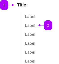
| Number | Type | Description | Optional | Info |
|---|---|---|---|---|
| 1 | Component | sbb-title | Yes | |
| 1 | Component | sbb-block-link | No |
Playground
The <sbb-link-list> is a component that can be used to collect and display sbb-block-link.
<sbb-link-list>
  <sbb-block-link
    href="https://www.sbb.ch/en/help-and-contact/refunds-compensation/ticket-refunds.html"
    >Refunds</sbb-block-link
  >
  <sbb-block-link
    href="https://www.sbb.ch/en/help-and-contact/lost-found-office/submit-loss-report.html"
    >Loss Report</sbb-block-link
  >
  ...
</sbb-link-list>
Slots
The component can display an optional title,
which is visually shown as a level-5 sbb-title
and is used as the aria-labelledby attribute of the ul element.
The title can be set using the titleContent property or, alternatively, can be projected using the title slot.
<sbb-link-list title-content="Help & Contact"> ... </sbb-link-list>
Style
The component will accept only <sbb-block-link> or <sbb-block-link-button> instances,
and it will sync its size and negative property with the inner links.
<sbb-link-list size="s" negative>
  <sbb-block-link
    href="https://www.sbb.ch/en/help-and-contact/refunds-compensation/ticket-refunds.html"
    >Refunds</sbb-block-link
  >
  <sbb-block-link
    href="https://www.sbb.ch/en/help-and-contact/lost-found-office/submit-loss-report.html"
    >Loss Report</sbb-block-link
  >
  ...
</sbb-link-list>
Orientation
The orientation property is used to set links' orientation; possible values are horizontal and vertical (default).
The optional property horizontalFrom can be used in combination with orientation='vertical'
to indicate the minimum breakpoint from which the orientation changes to horizontal.
The title will not be displayed in the horizontal orientation.
<sbb-link-list horizontal-from="large">
  <sbb-block-link
    href="https://www.sbb.ch/en/help-and-contact/refunds-compensation/ticket-refunds.html"
    >Refunds</sbb-block-link
  >
  <sbb-block-link
    href="https://www.sbb.ch/en/help-and-contact/lost-found-office/submit-loss-report.html"
    >Loss Report</sbb-block-link
  >
  ...
</sbb-link-list>
API Documentation
class: SbbLinkListElement, sbb-link-list
Properties
| Name | Attribute | Privacy | Type | Default | Description |
|---|---|---|---|---|---|
horizontalFrom | horizontal-from | public | SbbHorizontalFrom | null | null | Selected breakpoint from which the list is rendered horizontally. |
negative | negative | public | boolean | false | Negative coloring variant flag. |
orientation | orientation | public | SbbOrientation | 'vertical' | The orientation in which the list will be shown vertical or horizontal. |
size | size | public | SbbLinkSize | 's' / 'xs' (lean) | Text size of the nested sbb-block-link instances. This will overwrite the size attribute of nested sbb-block-link instances. |
titleContent | title-content | public | string | '' | The title text we want to show before the list. |
titleLevel | title-level | public | SbbTitleLevel | '2' | The semantic level of the title, e.g. 2 = h2. |
Slots
| Name | Description |
|---|---|
Use the unnamed slot to add one or more sbb-block-link. | |
title | Use this slot to provide a title. |