sbb-flip-card
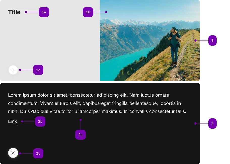
The <sbb-flip-card> component displays an informative card that reveals more information when clicked or toggled programmatically.
<sbb-flip-card>
  <sbb-flip-card-summary>
    <sbb-title> Card Title </sbb-title>
    <sbb-image slot="image" image-src="..." alt="..."></sbb-image>
  </sbb-flip-card-summary>
  <sbb-flip-card-details> Some additional text. </sbb-flip-card-details>
</sbb-flip-card>
With the <sbb-flip-card-summary> you can optionally add an overlapping <sbb-chip-label> by wrapping the
<sbb-image> in a figure tag (see sbb-image doc).
<sbb-flip-card>
  <sbb-flip-card-summary>
    ...
    <figure class="sbb-figure" slot="image">
      <sbb-image
        image-src="https://cdn.img.sbb.ch/content/dam/internet/externe-assets/lyne/Bahnhof-Luzern.jpg"
        alt="Station of Lucerne from outside"
      ></sbb-image>
      <sbb-chip-label class="sbb-figure-overlap-start-start">...</sbb-chip-label>
    </figure>
  </sbb-flip-card-summary>
</sbb-flip-card>
Style
The <sbb-flip-card> component has a predefined minimum height that can be customized by specifying the min-height property directly in the style of the host element with a custom height. Alternatively, when used within a CSS grid layout alongside other cards, the height can be adjusted using the grid-template-rows property. For consistent behavior and flexibility, it is recommended to use the minmax() function, for example: grid-template-rows: minmax(320px, 1fr).
<div
  style="display: grid; grid-template-rows: minmax(320px, 1fr); grid-template-columns: repeat(2, 1fr);"
>
  <sbb-flip-card>
    <sbb-flip-card-summary>
      <sbb-title> Card Title </sbb-title>
      <sbb-image slot="image" image-src="..." alt="..."></sbb-image>
    </sbb-flip-card-summary>
    <sbb-flip-card-details> Some additional text. </sbb-flip-card-details>
  </sbb-flip-card>

  <sbb-flip-card>
    <sbb-flip-card-summary>
      <sbb-title> Card Title </sbb-title>
      <sbb-image slot="image" image-src="..." alt="..."></sbb-image>
    </sbb-flip-card-summary>
    <sbb-flip-card-details> Some additional text. </sbb-flip-card-details>
  </sbb-flip-card>
</div>
Slots
The component will display the content slotted in the summary slot in the main view, and the content slotted inside the details slot after the card has been flipped.
States
The <sbb-flip-card> will switch to the flipped state after the user clicks on it or after the toggle method is called.
API Documentation
class: SbbFlipCardDetailsElement, sbb-flip-card-details
Slots
| Name | Description |
| Use the unnamed slot to provide any kind of content. |
class: SbbFlipCardElement, sbb-flip-card
Properties
| Name | Attribute | Privacy | Type | Default | Description |
accessibilityLabel | accessibility-label | public | string | '' | This will be forwarded as aria-label to the action in the non flipped state. If not set, the textContent of the sbb-flip-card-summary is taken. |
details | - | public | SbbFlipCardDetailsElement | null | | Returns the slotted sbb-flip-card-details. |
isFlipped | - | public | boolean | | Whether the flip card is flipped. |
summary | - | public | SbbFlipCardSummaryElement | null | | Returns the slotted sbb-flip-card-summary. |
Methods
| Name | Privacy | Description | Parameters | Return | Inherited From |
toggle | public | Toggles the state of the sbb-flip-card. | | void | |
Events
| Name | Type | Description | Inherited From |
flip | Event | Emits whenever the component is flipped. | |
Slots
| Name | Description |
| Use the unnamed slot to add a sbb-flip-card-summary and a sbb-flip-card-details element. |
class: SbbFlipCardSummaryElement, sbb-flip-card-summary
Properties
| Name | Attribute | Privacy | Type | Default | Description |
imageAlignment | image-alignment | public | SbbFlipCardImageAlignment | 'after' | The position where to render the image. |
Slots
| Name | Description |
| Use the unnamed slot to provide a title for the sbb-flip-card-summary. |
image | Use this slot to provide an image for the sbb-flip-card-summary. |
