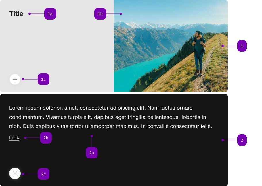
What does the component do?
It is part of the flip-card component.
When should the component be used?
- Only within the flip-card component.

| Number | Type | Description | Optional | Info |
|---|---|---|---|---|
| 1 | Component | sbb-flip-card-summary | No | |
| 1a | Component | sbb-title | No | |
| 1b | Component | sbb-image | No | |
| 1c | Component | sbb-secondary-button | No | Open-Action |
| 2 | Component | sbb-flip-card-details | No | |
| 2a | Text | Slot | No | |
| 2b | Component | sbb-link | Yes | |
| 2c | Component | sbb-secondary-button | No | Close-Action |
The sbb-flip-card-summary, when used inside a sbb-flip-card, shows its contents when the card is not flipped.
The component's slot is implicitly set to "summary".
<sbb-flip-card>
  <sbb-flip-card-summary>
    <sbb-title> Card Title </sbb-title>
    <sbb-image slot="image" image-src="..." alt="..."></sbb-image>
  </sbb-flip-card-summary>
</sbb-flip-card>
Slots
Use the unnamed slot to provide a title and the image slot to provide an image (via either sbb-image or img).
Optionally, you can add an overlapping sbb-chip-label by wrapping the sbb-image in a figure tag (see sbb-image doc).
<sbb-flip-card>
  <sbb-flip-card-summary>
    ...
    <figure class="sbb-figure" slot="image">
      <sbb-image
        image-src="https://cdn.img.sbb.ch/content/dam/internet/externe-assets/lyne/Bahnhof-Luzern.jpg"
        alt="Station of Lucerne from outside"
      ></sbb-image>
      <sbb-chip-label class="sbb-figure-overlap-start-start">...</sbb-chip-label>
    </figure>
  </sbb-flip-card-summary>
</sbb-flip-card>
Properties
| Name | Attribute | Privacy | Type | Default | Description |
|---|---|---|---|---|---|
imageAlignment | image-alignment | public | SbbFlipCardImageAlignment | 'after' | The position where to render the image. |
Slots
| Name | Description |
|---|---|
Use the unnamed slot to provide a title for the sbb-flip-card-summary. | |
image | Use this slot to provide an image for the sbb-flip-card-summary. |