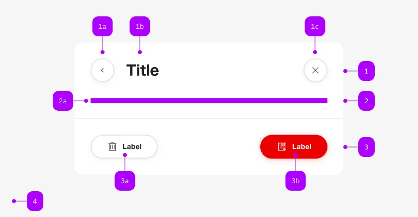
What does the component do?
It is part of the dialog component.
When should the component be used?
- Only within the dialog component.

| Number | Type | Description | Optional | Info |
|---|---|---|---|---|
| 1 | Component | sbb-dialog-title | No | |
| 2 | Component | sbb-dialog-close-button | Yes | Close-Action |
| 3 | Slot | Any content allowed | Yes | |
| 4 | Component | sbb-dialog-actions | Yes | |
| 4a | Component | sbb-secondary-button | Yes | Block-Links are also allowed |
| 4b | Component | sbb-button | Yes | Block-Links are also allowed |
The sbb-dialog-title component extends the sbb-title component.
Use it in combination with the sbb-dialog to display a header in the dialog.
<sbb-dialog>
  <sbb-dialog-title>A describing title of the dialog</sbb-dialog-title>
</sbb-dialog>
States
The title can have a negative state which is automatically synchronized with the negative state of the dialog.
Style
In scenarios where the visual representation needs to be different from the semantic meaning of the title level,
it is possible to use the visualLevel property (default value: 4).
Properties
| Name | Attribute | Privacy | Type | Default | Description |
|---|---|---|---|---|---|
level | level | public | SbbTitleLevel | '2' | Title level |
negative | negative | public | boolean | false | Negative coloring variant flag. |
visualLevel | visual-level | public | SbbTitleLevel | null | '4' | Visual level for the title. |
Slots
| Name | Description |
|---|---|
| Use the unnamed slot for the content of the dialog-title. |