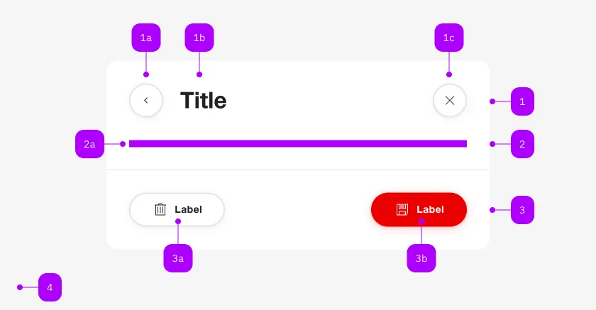
What does the component do?
It is part of the dialog component.
When should the component be used?
- Only within the dialog component.

| Number | Type | Description | Optional | Info |
|---|---|---|---|---|
| 1 | Component | sbb-dialog-title | No | |
| 2 | Component | sbb-dialog-close-button | Yes | Close-Action |
| 3 | Slot | Any content allowed | Yes | |
| 4 | Component | sbb-dialog-actions | Yes | |
| 4a | Component | sbb-secondary-button | Yes | Block-Links are also allowed |
| 4b | Component | sbb-button | Yes | Block-Links are also allowed |
Use the sbb-dialog-content in combination with the sbb-dialog to display a content inside the dialog.
<sbb-dialog>
  <sbb-dialog-content>Dialog content.</sbb-dialog-content>
</sbb-dialog>
Slots
| Name | Description |
|---|---|
| Use the unnamed slot to provide a dialog content. |