What does the component do?
It is part of the date-picker component.
When should the component be used?
- Only within the date-picker component.

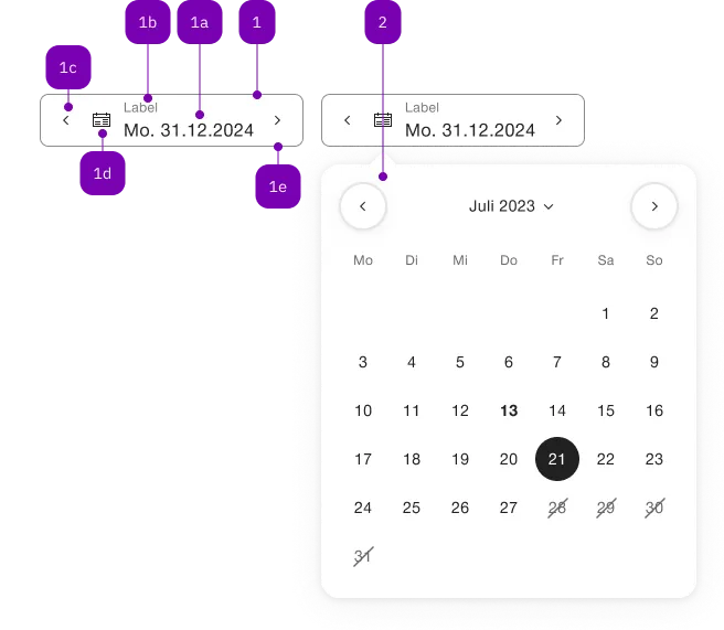
| Number | Type | Description | Optional | Info |
|---|---|---|---|---|
| 1 | Component | sbb-form-field | No | |
| 1a | Standard-HTML | input | No | |
| 1b | Standard-HTML | label | No | |
| 1c | Component | sbb-datepicker-previous-day | Yes | |
| 1d | Component | sbb-datepicker-toggle | Yes | |
| 1e | Component | sbb-datepicker-next-day | Yes | |
| 2 | Component | sbb-datepicker | No |
The <sbb-datepicker-previous-day> is a component related to the
sbb-date-input. When attached,
the <sbb-datepicker-previous-day> can be used to select the next available date
or tomorrow's date if the date input has no defined value.
The components can be connected using the input id reference attribute or property.
<sbb-datepicker-previous-day input="datepicker-input"></sbb-datepicker-previous-day>
<sbb-date-input id="datepicker-input"></sbb-date-input>
It is however recommend to use it in an <sbb-form-field>, which will
automatically take care of connecting the corresponding components.
In sbb-form-field
If the two components are used within a sbb-form-field,
they are automatically linked and, depending on the position relative to the
<sbb-date-input>, the <sbb-datepicker-previous-day> will be projected in the
prefix slot (if placed before the <sbb-date-input>) or the
suffix slot (if placed after the <sbb-date-input>) of the <sbb-form-field>.
The <sbb-datepicker-previous-day> has an internal disabled state, which is
synchronized with the <sbb-date-input> state:
It is disabled if the date input is disabled or if the selected date is equal
to the input's min attribute/property.
<sbb-form-field>
  <sbb-datepicker-previous-day></sbb-datepicker-previous-day>
  <sbb-date-input></sbb-date-input>
</sbb-form-field>
Properties
| Name | Attribute | Privacy | Type | Default | Description |
|---|---|---|---|---|---|
disabled | - | public | boolean | true | Whether this button is disabled. |
form | form | public | HTMLFormElement | null | The <form> element to associate the button with. | |
input | input | public | SbbDateInputElement<T> | null | null | The associated date input element. For attribute usage, provide an id reference. |
name | name | public | string | Name of the form element. Will be read from name attribute. | |
negative | negative | public | boolean | false | Negative coloring variant flag. |
type | type | public | SbbButtonType | 'button' | The type attribute to use for the button. |
validationMessage | - | public | string | Returns the current error message, if available, which corresponds to the current validation state. Please note that only one message is returned at a time (e.g. if multiple validity states are invalid, only the chronologically first one is returned until it is fixed, at which point the next message might be returned, if it is still applicable). Also, a custom validity message (see below) has precedence over native validation messages. | |
validity | - | public | ValidityState | Returns the ValidityState object for this element. | |
value | value | public | string | '' | Value of the form element. |
willValidate | - | public | boolean | Returns true if this element will be validated when the form is submitted; false otherwise. |
Methods
| Name | Privacy | Description | Parameters | Return | Inherited From |
|---|---|---|---|---|---|
checkValidity | public | Returns true if this element has no validity problems; false otherwise. Fires an invalid event at the element in the latter case. | boolean | SbbFormAssociatedMixin | |
reportValidity | public | Returns true if this element has no validity problems; otherwise, returns false, fires an invalid event at the element, and (if the event isn't canceled) reports the problem to the user. | boolean | SbbFormAssociatedMixin | |
setCustomValidity | public | Sets the custom validity message for this element. Use the empty string to indicate that the element does not have a custom validity error. | message: string | void | SbbFormAssociatedMixin |