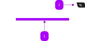
What does the component do?
A carousel is an interactive element for displaying multiple pieces of content within a limited area. It displays one or more pieces of content at a time and allows horizontal scrolling using navigation elements or gestures.
When should the component be used?
- When several similar pieces of content are to be displayed, but there is not enough space for all of them at once.
- When the focus is on a visual or content sequence (e.g., highlights, campaigns, products).
- When space is limited and content needs to be presented in a space-saving manner.
Rules
- No more than 7 slides should be used.
- Each slide should have a clear focus.
- Carousels should not change automatically—only manual control by the user.

| Number | Type | Description | Optional | Info |
|---|---|---|---|---|
| 1 | Slot | Beliebiger Inhalt erlaubt | No | |
| 2 | Component | sbb-card-badge | Yes |
Playground
Slide 1
Slilde 2
Slide 3
The <sbb-carousel> is a slideshow component that can be used to display a
series of items, as images, once at a time, allowing users to cycle
through them via horizontal scrolling or using controls (e.g. a paginator).
The component must be used together with a
sbb-compact-paginator
and a <sbb-carousel-list>, which accepts one or more <sbb-carousel-item>.
<sbb-carousel>
  <sbb-carousel-list>
    <sbb-carousel-item>
      <img src="../img-1.jpg" alt="Image 1" height="300" width="400" />
    </sbb-carousel-item>
    <sbb-carousel-item>
      <sbb-image
        image-src="../image.jpg"
        alt="SBB image"
        style="width: 800px; height: 600px;"
      ></sbb-image>
    </sbb-carousel-item>
    <sbb-carousel-item>
      <div class="sbb-image">
        <img src="../image.jpg" alt="SBB image" height="300" width="400" />
        <figcaption>Caption for picture</figcaption>
      </div>
    </sbb-carousel-item>
  </sbb-carousel-list>
  <sbb-compact-paginator></sbb-compact-paginator>
</sbb-carousel>
The length and the pageSize properties of the <sbb-compact-paginator>
are automatically set based on the number of slotted images.
The values of the accessibilityPageLabel, accessibilityPreviousPageLabel and accessibilityNextPageLabel properties
are also set, in order to automatically override the 'page' keyword to the 'slide' one.
If needed, consumers can provide their own values.
The <sbb-carousel-item> supports native img tags, <sbb-image>, picture
and also custom content, appropriately formatted.
Since it doesn't have a fixed size, it's important for consumers to define
the dimensions of slotted images to correctly render the component.
Interactions
It's possible to switch between items using the paginator controls, or, if the component is focused, using the arrow keys.
| Keyboard | Action |
|---|---|
| Down Arrow / Right Arrow | Navigate to the next item. |
| Up Arrow / Left Arrow | Navigate to the previous item. |
Events
The <sbb-carousel-item> component provides the two events beforeshow
and show; their dispatch is related to scroll events in the
<sbb-carousel-list>.
The beforeshow is dispatched when an item is being scrolled into view
and the show is dispatched when the item is fully visible.
Style
The carousel determines its dimensions by reading the dimensions from the first slotted <sbb-carousel-item> element.
It is the consumers' responsibility to set the correct height and width of the items, and to ensure that they are all the same size.
These dimensions are read only once, when the component is first connected to the DOM or first becomes visible.
In special cases, such as when the carousel size needs to be responsive, it is recommended to manually
set the width and height CSS properties on the <sbb-carousel-list> element.
Manually set dimensions will take precedence over the automatically read dimensions.
Accessibility
Following the ARIA carousel pattern,
the <sbb-carousel> component has role="region" and aria-label="carousel" and the <sbb-carousel-list> component has aria-atomic='true' and aria-live='polite'.
If no aria-label is provided on the slotted <sbb-carousel-item>
instances, the component sets a default value on them..
To not break the accessibility when links are used together with images, please place the image within the anchor tag.
<sbb-carousel>
  <sbb-carousel-list>
    <sbb-carousel-item>
      <a href="#" target="_blank">
        <img src="../img-1.jpg" alt="SBB image" height="300" width="400" />
      </a>
    </sbb-carousel-item>
    ...
</sbb-carousel>
API Documentation
class: SbbCarouselElement, sbb-carousel
Properties
| Name | Attribute | Privacy | Type | Default | Description |
|---|---|---|---|---|---|
shadow | shadow | public | boolean | false | Used to display a box-shadow around the component. |
Slots
| Name | Description |
|---|---|
Use the unnamed slot to add the sbb-carousel-list for content and a sbb-paginator for controls. |
class: SbbCarouselItemElement, sbb-carousel-item
Events
| Name | Type | Description | Inherited From |
|---|---|---|---|
beforeshow | CustomEvent<SbbCarouselItemEventDetail> | Event emitted when the item is starting scrolling. | |
show | CustomEvent<SbbCarouselItemEventDetail> | Event emitted when the item is full visible after scrolling. |
Slots
| Name | Description |
|---|---|
| Use the unnamed slot to add images for the carousel, as |
class: SbbCarouselListElement, sbb-carousel-list
Slots
| Name | Description |
|---|---|
Use the unnamed slot to add sbb-carousel-item elements. |