Zur Navigation Zum Inhalt Kontakt Find component Overview Lyne
Deutsch Français Italiano English Card-Badge Info

What does the component do?

It is part of the card and selection-expansion-panel component.
When should the component be used?

  • Only within the card and selection-expansion-panel component.
Card
Anatomy
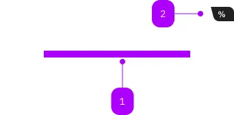
Anatomy of the component
Number Type Description Optional Info
1 Slot Beliebiger Inhalt erlaubt No
2 Component sbb-card-badge Yes
Demo

Playground

%from CHF92.50Black Friday
Color Charcoal White
Charcoal
White
Copy HTML to clipboard.
Implementation

The sbb-card-badge can contain some information like prices or discounts,
and can be used in sbb-card or
sbb-selection-expansion-panel.

To achieve the correct spacing between elements inside the card badge, we recommend to use span-elements.
All content parts are presented with a predefined gap in between.

<sbb-card>
  <sbb-card-badge aria-label="Super saver sales ticket price starts at CHF 19.99">
    <span>%</span>
    <span>from CHF</span>
    <span>19.99</span>
  </sbb-card-badge>
  Card content...
</sbb-card>

Accessibility

It's recommended to place an aria-label on sbb-card-badge to describe the displayed information in a full sentence,
as in the example above.

Properties

Name Attribute Privacy Type Default Description
color color public 'charcoal' | 'white' 'charcoal' Color of the card badge.

Slots

Name Description
Use the unnamed slot to add content to the badge. Content parts should be wrapped in <span> tags to achieve correct spacings.
Find component

Lyne

  • Design Tokens
  • Animation
    Animation
  • Border
    Border
  • Breakpoint
    Breakpoint
  • Color
    Color
  • Layout
    Layout
  • Shadow
    Shadow
  • Size
    Size
  • Spacings
    Spacings
  • Typography
    Typography
  • Action
  • More Info
    Action-Group
  • More Info
    Block-Link
  • More Info
    Button
  • More Info
    Link
  • More Info
    Mini-Button-Group
  • More Info
    Secondary-Button
  • More Info
    Teaser
  • More Info
    Teaser-Hero
  • More Info
    Teaser-Product
  • More Info
    Teaser-Product-Static
  • More Info
    Accent-Button
  • More Info
    Transparent-Button
  • Brand
  • More Info
    Clock
  • More Info
    Logo
  • Collection
  • More Info
    Link-List
  • More Info
    Link-List-Anchor
  • More Info
    Paginator
  • More Info
    Compact-Paginator
  • More Info
    Skiplink-List
  • More Info
    Table-Wrapper
  • Form
  • More Info
    Autocomplete
  • More Info
    Autocomplete-Grid
  • More Info
    Calendar
  • More Info
    Checkbox
  • More Info
    Checkbox-Group
  • More Info
    Checkbox-Panel
  • More Info
    Datepicker
  • More Info
    File-Selector-Dropzone
  • More Info
    File-Selector
  • More Info
    Form-Field
  • More Info
    Radio-Button
  • More Info
    Radio-Button-Group
  • More Info
    Radio-Button-Panel
  • More Info
    Select
  • More Info
    Selection-Expansion-Panel
  • More Info
    Slider
  • More Info
    Toggle
  • More Info
    Toggle-Check
  • Indicator
  • More Info
    Alert
  • More Info
    Alert-Group
  • More Info
    Chip-Label
  • More Info
    Loading-Indicator
  • More Info
    Loading-Indicator-Circle
  • More Info
    Message
  • More Info
    Notification
  • More Info
    Status
  • More Info
    Stepper
  • More Info
    Tag-Group
  • More Info
    Toast
  • Layout
  • More Info
    Accordion
  • More Info
    Card
  • More Info
    Container
  • More Info
    Divider
  • More Info
    Footer
  • More Info
    Header
  • More Info
    Map-Container
  • More Info
    Title
  • Navigation
  • More Info
    Breadcrumb
  • More Info
    Breadcrumb-Group
  • More Info
    Menu
  • More Info
    Navigation
  • More Info
    Tab-Group
  • Overlay
  • More Info
    Dialog
  • More Info
    Overlay
  • More Info
    Popover
  • Time-Table
  • More Info
    Journey-Header
  • Visual asset
  • More Info
    Icon
  • More Info
    Image
Imprint Contact Data privacy Cookie settings