What does the component do?
The component offers the same functionalities as the Autocomplete component, but also offers the option of displaying buttons next to the options.
When should the component be used?
- Only if buttons are required in addition to the options shown in the autocomplete list.
Rules.
- The component should not be used for small data sets (e.g. only 10 entries/options).
- The autocomplete list should not display too many suggestions at once in order to maintain clarity (max. 10 suggestions).
- Users should be able to ignore the autocomplete function and make their own entries.
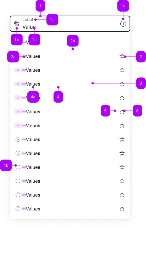
| Number | Type | Description | Optional | Info |
|---|---|---|---|---|
| 1 | Component | sbb-form-field | No | |
| 1a | Standard-HTML | label | No | |
| 1b | Standard-HTML | input | No | |
| 1c | Component | sbb-icon | Yes | Prefix |
| 1d | Component | sbb-icon | Yes | Suffix |
| 2 | Component | sbb-autocomplete-grid-optgroup | Yes | |
| 2a | Text | Label | No | |
| 2b | Component | sbb-divider | - | Appears with an sbb-autocomplete-grid-optgroup |
| 3 | Component | sbb-autocomplete-grid-row | No | |
| 4 | Component | sbb-autocomplete-grid-option | No | |
| 4a | Text | Value | No | |
| 4b | Component | sbb-icon | Yes | |
| 5 | Component | sbb-autocomplete-grid-cell | Yes | |
| 6 | Component | sbb-autocomplete-grid-button | Yes |
Playground.
The <sbb-autocomplete-grid> is a component that can be used to display a panel of suggested options connected to a text input,
with each option connected to one or more buttons.
Use it when you need an autocomplete in which every selectable option in the panel needs one or more related button.
If you don't need actions, use the sbb-autocomplete.
The component is strictly connected to:
- the
<sbb-autocomplete-grid-row>, which is a wrapper for both option and buttons; - the
<sbb-autocomplete-grid-option>, which displays a selectable option within a panel; - the
<sbb-autocomplete-grid-cell>, which is a wrapper a for button element; - the
<sbb-autocomplete-grid-button>, which displays a button within a row; - the
<sbb-autocomplete-grid-optgroup>, which can be used to group more row within a group.
It's possible to set the element to which the component's panel will be attached using the origin prop,
and the input which will work as a trigger using the trigger prop.
Both accept an id or an element reference.
<!-- Origin element -->
<div id="autocomplete-origin">Another origin</div>

<!-- Trigger element -->
<input id="autocomplete-txt" placeholder="Another trigger element" />

<sbb-autocomplete-grid origin="autocomplete-origin" trigger="autocomplete-txt">
  <sbb-autocomplete-grid-row>
    <sbb-autocomplete-grid-option value="1">Option 1</sbb-autocomplete-grid-option>
    <sbb-autocomplete-grid-cell>
      <sbb-autocomplete-grid-button icon-name="pen-small"></sbb-autocomplete-grid-button>
    </sbb-autocomplete-grid-cell>
  </sbb-autocomplete-grid-row>
  <sbb-autocomplete-grid-row>
    <sbb-autocomplete-grid-option value="2">Option 2</sbb-autocomplete-grid-option>
    <sbb-autocomplete-grid-cell>
      <sbb-autocomplete-grid-button icon-name="trash-small"></sbb-autocomplete-grid-button>
    </sbb-autocomplete-grid-cell>
  </sbb-autocomplete-grid-row>
</sbb-autocomplete-grid>
In <sbb-form-field>.
If the component is used within a sbb-form-field,
it will automatically connect to the native <input> as trigger and will display the option panel above or below the <sbb-form-field>.
<!-- Origin element -->
<sbb-form-field>
  <label>Label</label>
  <!-- Trigger element -->
  <input placeholder="Trigger element" />

  <sbb-autocomplete-grid>
    <sbb-autocomplete-grid-row>
      <sbb-autocomplete-grid-option value="1">Option 1</sbb-autocomplete-grid-option>
      <sbb-autocomplete-grid-cell>
        <sbb-autocomplete-grid-button icon-name="pen-small"></sbb-autocomplete-grid-button>
      </sbb-autocomplete-grid-cell>
    </sbb-autocomplete-grid-row>
    <sbb-autocomplete-grid-row>
      <sbb-autocomplete-grid-option value="2">Option 2</sbb-autocomplete-grid-option>
      <sbb-autocomplete-grid-cell>
        <sbb-autocomplete-grid-button icon-name="trash-small"></sbb-autocomplete-grid-button>
      </sbb-autocomplete-grid-cell>
    </sbb-autocomplete-grid-row>
  </sbb-autocomplete-grid>
</sbb-form-field>
Style.
Option highlight.
By default, the <sbb-autocomplete-grid> will highlight the label of the <sbb-autocomplete-grid-option> in the panel,
if it matches the typed text.
Option grouping.
The displayed <sbb-autocomplete-grid-option> can be collected into groups using <sbb-autocomplete-grid-optgroup> element:
<!-- Origin element -->
<sbb-form-field>
  <label>Label</label>
  <!-- Trigger element -->
  <input placeholder="Trigger element" />

  <sbb-autocomplete-grid>
    <sbb-autocomplete-grid-optgroup>
      <sbb-autocomplete-grid-row>
        <sbb-autocomplete-grid-option value="1">Option 1</sbb-autocomplete-grid-option>
        <sbb-autocomplete-grid-cell>
          <sbb-autocomplete-grid-button icon-name="pen-small"></sbb-autocomplete-grid-button>
        </sbb-autocomplete-grid-cell>
      </sbb-autocomplete-grid-row>
      ...
    </sbb-autocomplete-grid-optgroup>
    <sbb-autocomplete-grid-optgroup>
      <sbb-autocomplete-grid-row>
        <sbb-autocomplete-grid-option value="100">Option 100</sbb-autocomplete-grid-option>
        <sbb-autocomplete-grid-cell>
          <sbb-autocomplete-grid-button icon-name="pen-small"></sbb-autocomplete-grid-button>
        </sbb-autocomplete-grid-cell>
      </sbb-autocomplete-grid-row>
      ...
    </sbb-autocomplete-grid-optgroup>
  </sbb-autocomplete-grid>
</sbb-form-field>
Size.
The component has a size property with two sizes available. When slotted in a <sbb-form-field> element, it adapts to the <sbb-form-field> element size.
<sbb-form-field size="s">
  <label>Label</label>
  <input placeholder="Trigger element" />
  <sbb-autocomplete-grid> ... </sbb-autocomplete-grid>
</sbb-form-field>
Events.
The <sbb-autocomplete-grid-option> emits the autocompleteoptionselected event when selected via user interaction.
Keyboard interaction.
The options panel opens on focus, click or input events on the trigger element, or on ArrowDown keypress;
it can be closed on backdrop click, or using the Escape or Tab keys.
| Keyboard | Action |
|---|---|
| Down Arrow | Navigate to the next option. Open the panel, if closed. |
| Up Arrow | Navigate to the previous option. |
| Right Arrow | Navigate to the next button. |
| Left Arrow | Navigate to the previous button. |
| Enter | Select the active option/button. |
| Escape | Close the autocomplete panel. |
Setting the autoSelectActiveOption property to true allows users
to automatically select the option reached via keyboard navigation as the input value,
without having to press the Enter key to confirm.
On the other hand, it's possible to use the requireSelection to clear the input
if the user does not explicitly select a value, via mouse click or keyboard selection.
Accessibility.
The <sbb-autocomplete-grid> implements the ARIA combobox-grid interaction pattern.
The text input trigger specifies role="combobox" while the content of the pop-up applies role="grid".
The inner option and actions have role="gridcell", while the buttons inside the action have role="button".
Note that since the focus must always be on the connected input, those buttons can't be reached via Tab,
but only with arrow navigation; note also that when a button is reached, going up or down will move to the previous/next option
and not to the previous/next button.
The component preserves focus on the input trigger,
using aria-activedescendant to support navigation though the autocomplete options.
Complex Values.
This component supports any types of values, including complex objects.
The type can be specified using the generic type parameter T of SbbAutocompleteGrid<T> and SbbAutocompleteGridOption<T>.
const values = [
  { value: 'value 1', name: 'Option 1' },
  { value: 'value 2', name: 'Option 2' },
];
<sbb-form-field>
  <input />
  <sbb-autocomplete-grid .displayWith="${(value) => value.name}">
    <sbb-autocomplete-grid-row>
      <sbb-autocomplete-grid-option .value="${values[0]}">Option 1</sbb-autocomplete-grid-option>
      ...
    </sbb-autocomplete-grid-row>
    <sbb-autocomplete-grid-row>
      <sbb-autocomplete-grid-option .value="${values[1]}">Option 2</sbb-autocomplete-grid-option>
      ...
    </sbb-autocomplete-grid-row>
  </sbb-autocomplete-grid>
</sbb-form-field>
displayWith function.
When using complex values, the selection should most likely still be represented as text.
To achieve this, you can use the displayWith property which accepts a function.
This function receives the selected value and should return a string.
Please note that the parameter is the assigned value of the selected option which does not necessarily
align with the type information.
API Documentation.
class: SbbAutocompleteGridButtonElement, sbb-autocomplete-grid-button.
Properties.
| Name | Attribute | Privacy | Type | Default | Description |
|---|---|---|---|---|---|
disabled | disabled | public | boolean | false | Whether the component is disabled. |
iconName | icon-name | public | string | '' | The icon name we want to use, choose from the small icon variants from the ui-icons category from here https://icons.app.sbb.ch. |
negative | negative | public | boolean | false | Negative coloring variant flag. |
optgroup | - | public | SbbAutocompleteGridOptgroupElement | null | ||
option | - | public | SbbAutocompleteGridOptionElement | null | Gets the SbbAutocompleteGridOptionElement on the same row of the button. |
Slots.
| Name | Description |
|---|---|
icon | Slot used to display the icon, if one is set |
class: SbbAutocompleteGridCellElement, sbb-autocomplete-grid-cell.
Slots.
| Name | Description |
|---|---|
Use the unnamed slot to add a sbb-autocomplete-grid-button element. |
class: SbbAutocompleteGridElement, sbb-autocomplete-grid.
Properties.
| Name | Attribute | Privacy | Type | Default | Description |
|---|---|---|---|---|---|
autoActiveFirstOption | auto-active-first-option | public | boolean | false | Whether the first option is automatically activated when the autocomplete is opened. |
autoSelectActiveOption | auto-select-active-option | public | boolean | false | Whether the active option should be selected as the user is navigating. |
autoSelectActiveOptionOnBlur | auto-select-active-option-on-blur | public | boolean | false | When enabled, the active option is automatically selected on blur. This is an experimental feature. It might be subject to changes. |
displayWith | - | public | ((value: T) => string) | null | null | Function that maps an option's control value to its display value in the trigger. |
isOpen | - | public | boolean | Whether the element is open. | |
negative | negative | public | boolean | false | Negative coloring variant flag. |
origin | origin | public | HTMLElement | null | null | The element where the autocomplete will attach. If not set, as fallback there are two elements which can act as origin with following priority order: 1. sbb-form-field if it is an ancestor. 2. trigger element if set. For attribute usage, provide an id reference. |
originElement | - | public | HTMLElement | null | Returns the element where the autocomplete overlay is attached to. | |
position | position | public | 'auto' | 'above' | 'below' | 'auto' | The position of the autocomplete panel relative to the trigger. |
preserveIconSpace | preserve-icon-space | public | boolean | false | Whether the icon space is preserved when no icon is set. |
requireSelection | require-selection | public | boolean | false | Whether the user is required to make a selection when they're interacting with the autocomplete. If the user moves away from the autocomplete without selecting an option from the list, the value will be reset. If the user opens the panel and closes it without interacting or selecting a value, the initial value will be kept. |
size | size | public | 's' | 'm' | null | null | Size variant, either s (lean theme default) or m (standard theme default). When placed inside an <sbb-form-field>, the size is inherited from the form field. |
trigger | trigger | public | HTMLInputElement | null | null | The input element that will trigger the autocomplete opening. By default, the autocomplete will open on focus, click, input or ArrowDown keypress of the 'trigger' element. If not set, will search for the first 'input' child of a 'sbb-form-field' ancestor. For attribute usage, provide an id reference. |
triggerElement | - | public | HTMLInputElement | null | Returns the trigger element. |
Methods.
| Name | Privacy | Description | Parameters | Return | Inherited From |
|---|---|---|---|---|---|
close | public | Closes the autocomplete. | void | SbbOpenCloseBaseElement | |
escapeStrategy | public | The method which is called on escape key press. Defaults to calling close() | void | SbbOpenCloseBaseElement | |
open | public | Opens the autocomplete. | void | SbbOpenCloseBaseElement |
Events.
| Name | Type | Description | Inherited From |
|---|---|---|---|
beforeclose | Event | Emits whenever the component begins the closing transition. Can be canceled. | SbbOpenCloseBaseElement |
beforeopen | Event | Emits whenever the component starts the opening transition. Can be canceled. | SbbOpenCloseBaseElement |
change | Event | The change event is fired on the autocomplete's trigger when the user modifies the element's value. Unlike the input event, the change event is not necessarily fired for each alteration to an element's value. | SbbAutocompleteBaseElement |
close | Event | Emits whenever the component is closed. | SbbOpenCloseBaseElement |
input | InputEvent | The input event fires on the autocomplete's trigger when the value has been changed as a direct result of a user action. | SbbAutocompleteBaseElement |
open | Event | Emits whenever the component is opened. | SbbOpenCloseBaseElement |
CSS Properties.
| Name | Default | Description |
|---|---|---|
--sbb-autocomplete-z-index | var(--sbb-overlay-default-z-index) | To specify a custom stack order, the z-index can be overridden by defining this CSS variable. The default z-index of the component is set to var(--sbb-overlay-default-z-index) with a value of 1000. |
--sbb-options-panel-max-height | Maximum height of the options panel. If the calculated remaining space is smaller, the value gets ignored. |
Slots.
| Name | Description |
|---|---|
Use the unnamed slot to add sbb-autocomplete-grid-row or sbb-autocomplete-grid-optgroup elements to the sbb-autocomplete-grid. |
class: SbbAutocompleteGridOptgroupElement, sbb-autocomplete-grid-optgroup.
Properties.
| Name | Attribute | Privacy | Type | Default | Description |
|---|---|---|---|---|---|
disabled | disabled | public | boolean | false | Whether the component is disabled. |
label | label | public | string | '' | Option group label. |
Slots.
| Name | Description |
|---|---|
Use the unnamed slot to add sbb-autocomplete-grid-option elements to the sbb-autocomplete-grid-optgroup. |
class: SbbAutocompleteGridOptionElement, sbb-autocomplete-grid-option.
Properties.
| Name | Attribute | Privacy | Type | Default | Description |
|---|---|---|---|---|---|
disabled | disabled | public | boolean | false | Whether the component is disabled. |
iconName | icon-name | public | string | '' | The icon name we want to use, choose from the small icon variants from the ui-icons category from here https://icons.app.sbb.ch. |
selected | selected | public | boolean | Whether the option is selected. | |
value | value | public | T = string | null | Value of the option. |
Events.
| Name | Type | Description | Inherited From |
|---|---|---|---|
optionselected | Event | Emits when an option was selected by user. | SbbOptionBaseElement |
CSS Properties.
| Name | Default | Description |
|---|---|---|
--sbb-option-icon-container-display | none | Can be used to reserve space even when preserve-icon-space on autocomplete is not set or iconName is not set. |
Slots.
| Name | Description |
|---|---|
| Use the unnamed slot to add content to the option label. | |
icon | Use this slot to provide an icon. If icon-name is set, a sbb-icon will be used. |
class: SbbAutocompleteGridRowElement, sbb-autocomplete-grid-row.
Slots.
| Name | Description |
|---|---|
Use the unnamed slot to add a sbb-autocomplete-grid-option and a sbb-autocomplete-grid-cell with one or more sbb-autocomplete-grid-button. |