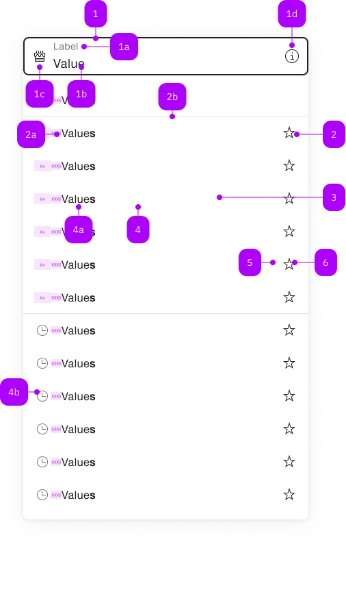
What does the component do?
It is part of the autocomplete-grid-row component.
When should the component be used?
- Only within the autocomplete-grid-row component.

| Number | Type | Description | Optional | Info |
|---|---|---|---|---|
| 1 | Component | sbb-form-field | No | |
| 1a | Standard-HTML | label | No | |
| 1b | Standard-HTML | input | No | |
| 1c | Component | sbb-icon | Yes | Prefix |
| 1d | Component | sbb-icon | Yes | Suffix |
| 2 | Component | sbb-autocomplete-grid-optgroup | Yes | |
| 2a | Text | Label | No | |
| 2b | Component | sbb-divider | - | Appears with an sbb-autocomplete-grid-optgroup |
| 3 | Component | sbb-autocomplete-grid-row | No | |
| 4 | Component | sbb-autocomplete-grid-option | No | |
| 4a | Text | Value | No | |
| 4b | Component | sbb-icon | Yes | |
| 5 | Component | sbb-autocomplete-grid-cell | Yes | |
| 6 | Component | sbb-autocomplete-grid-button | Yes |
The sbb-autocomplete-grid-option is a component which can be used to display items in the
sbb-autocomplete-grid.
<sbb-form-field label="Label">
  <input />
  <sbb-autocomplete-grid>
    <sbb-autocomplete-grid-row>
      <sbb-autocomplete-grid-option value="1">Option 1</sbb-autocomplete-grid-option>
      <sbb-autocomplete-grid-cell>
        <sbb-autocomplete-grid-button icon-name="pen-small"></sbb-autocomplete-grid-button>
      </sbb-autocomplete-grid-cell>
    </sbb-autocomplete-grid-row>
    <sbb-autocomplete-grid-row>
      <sbb-autocomplete-grid-option value="2">Option 2</sbb-autocomplete-grid-option>
      <sbb-autocomplete-grid-cell>
        <sbb-autocomplete-grid-button icon-name="trash-small"></sbb-autocomplete-grid-button>
      </sbb-autocomplete-grid-cell>
    </sbb-autocomplete-grid-row>
  </sbb-autocomplete-grid>
</sbb-form-field>
Slots
It is possible to provide a label via an unnamed slot; the component can optionally display a sbb-icon
at the component start using the iconName property or via custom content using the icon slot.
<sbb-autocomplete-grid-option value="1">Option 1</sbb-autocomplete-grid-option>

<sbb-autocomplete-grid-option value="1" icon-name="coins-small"
  >Option 1</sbb-autocomplete-grid-option
>
States
Like the native option, the component has a value property.
The selected and disabled properties are connected to the self-named states.
When disabled, the selection via click is prevented.
If the sbb-autocomplete-grid-option is nested in a sbb-autocomplete-grid-optgroup component, it inherits from the parent the disabled state.
<sbb-autocomplete-grid-option value="value" selected>Option label</sbb-autocomplete-grid-option>

<sbb-autocomplete-grid-option value="value" disabled>Option label</sbb-autocomplete-grid-option>
Events
Consumers can listen to the optionselected event on the sbb-autocomplete-grid-option component to intercept the selected value;
the event is triggered if the element has been selected by some user interaction. Alternatively,
the selectionChange event can be listened to, which is triggered if the element has been both selected or deselected.
Style
If the label slot contains only a text node, it is possible to search for text in the sbb-autocomplete-grid-option using the
highlight method, passing the desired text; if the text is present it will be highlighted in bold.
<!-- Supported scenario -->
<sbb-autocomplete-grid-option> Highlightable caption</sbb-autocomplete-grid-option>

<!-- Not supported scenarios -->
<sbb-autocomplete-grid-option>
  <span>Not highlightable caption</span>
</sbb-autocomplete-grid-option>

<sbb-autocomplete-grid-option>
  <img src="..." />
  Highlightable caption
</sbb-autocomplete-grid-option>
Accessibility
The sbb-autocomplete-grid follows the combobox grid pattern;
this means that the sbb-autocomplete-grid-option has a gridcell role and its id is set from sbb-autocomplete-grid-row's id,
which is needed to correctly set the aria-activedescendant on the related input.
Complex Values
This component supports any types of values, including complex objects.
The type can be specified using the generic type parameter T of SbbAutocompleteGridOption<T>.
<sbb-autocomplete-grid-option .value=${{value: 'value', name: 'name'}} name="name">Option</sbb-autocomplete-grid-option>
CSS Properties
| Name | Default | Description |
|---|---|---|
--sbb-option-icon-container-display | none | Can be used to reserve space even when preserve-icon-space on autocomplete is not set or iconName is not set. |
Slots
| Name | Description |
|---|---|
| Use the unnamed slot to add content to the option label. | |
icon | Use this slot to provide an icon. If icon-name is set, a sbb-icon will be used. |