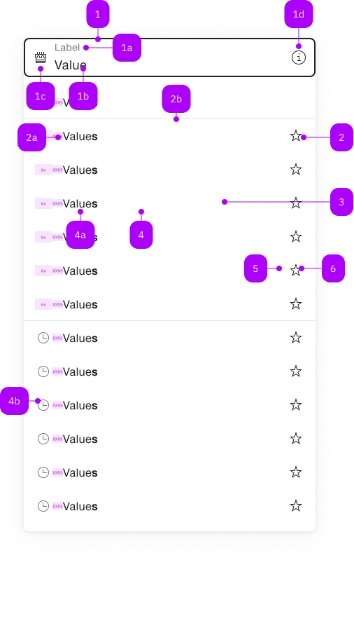
What does the component do?
It is part of the autocomplete-grid-cell component.
When should the component be used?
- Only within the autocomplete-grid-cell component.

| Number | Type | Description | Optional | Info |
|---|---|---|---|---|
| 1 | Component | sbb-form-field | No | |
| 1a | Standard-HTML | label | No | |
| 1b | Standard-HTML | input | No | |
| 1c | Component | sbb-icon | Yes | Prefix |
| 1d | Component | sbb-icon | Yes | Suffix |
| 2 | Component | sbb-autocomplete-grid-optgroup | Yes | |
| 2a | Text | Label | No | |
| 2b | Component | sbb-divider | - | Appears with an sbb-autocomplete-grid-optgroup |
| 3 | Component | sbb-autocomplete-grid-row | No | |
| 4 | Component | sbb-autocomplete-grid-option | No | |
| 4a | Text | Value | No | |
| 4b | Component | sbb-icon | Yes | |
| 5 | Component | sbb-autocomplete-grid-cell | Yes | |
| 6 | Component | sbb-autocomplete-grid-button | Yes |
The sbb-autocomplete-grid-button component has the same appearance of a sbb-mini-button,
but it's only designed to be used within the sbb-autocomplete-grid-cell
inside a sbb-autocomplete-grid.
<sbb-form-field label="Label">
  <input />
  <sbb-autocomplete-grid>
    <sbb-autocomplete-grid-row>
      <sbb-autocomplete-grid-option value="1">Option 1</sbb-autocomplete-grid-option>
      <sbb-autocomplete-grid-cell>
        <sbb-autocomplete-grid-button icon-name="pen-small"></sbb-autocomplete-grid-button>
      </sbb-autocomplete-grid-cell>
    </sbb-autocomplete-grid-row>
    <sbb-autocomplete-grid-row>
      <sbb-autocomplete-grid-option value="2">Option 2</sbb-autocomplete-grid-option>
      <sbb-autocomplete-grid-cell>
        <sbb-autocomplete-grid-button icon-name="trash-small"></sbb-autocomplete-grid-button>
      </sbb-autocomplete-grid-cell>
    </sbb-autocomplete-grid-row>
  </sbb-autocomplete-grid>
</sbb-form-field>
Slots
The component can display a sbb-icon using the iconName property or via custom content using the icon slot.
<sbb-autocomplete-grid-button icon-name="pen-small"></sbb-autocomplete-grid-button>

<sbb-autocomplete-grid-button>
  <sbb-icon slot="icon" name="info"></sbb-icon>
</sbb-autocomplete-grid-button>
Style
The component has a negative variant which can be set using the negative property.
The component can be displayed in disabled state using the self-named property.
<sbb-autocomplete-grid-button icon-name="pen-small" negative></sbb-autocomplete-grid-button>

<sbb-autocomplete-grid-button icon-name="pen-small" disabled></sbb-autocomplete-grid-button>
If the component is used within a sbb-autocomplete-grid-optgroup,
it can be disabled by disabling the optgroup.
Interactions
When the button is clicked, an event is triggered; the behavior is up to the consumer.
It's possible to fetch the button's related sbb-autocomplete-grid-option using the option property.
<sbb-form-field label="Label">
  <input />
  <sbb-autocomplete-grid>
    <sbb-autocomplete-grid-row>
      <sbb-autocomplete-grid-option value="1">Option 1</sbb-autocomplete-grid-option>
      <sbb-autocomplete-grid-cell>
        <sbb-autocomplete-grid-button
          id="button"
          icon-name="pen-small"
        ></sbb-autocomplete-grid-button>
      </sbb-autocomplete-grid-cell>
    </sbb-autocomplete-grid-row>
  </sbb-autocomplete-grid>
</sbb-form-field>

<script>
  // get option
  const getOptionFromButton: () => SbbAutocompleteGridOptionElement = () => {
    return document.getElementById('button').option;
  }
  // get option from click event
  document.getElementById('button').addEventListener('click', (evt) => {
    const btn = evt.target as SbbAutocompleteGridButtonElement;
    console.log(`Button clicked on row ${btn.option.textContent} with value: '${btn.option.value}'`);
  });
</script>
Accessibility
The sbb-autocomplete-grid follows the combobox grid pattern;
this means that the sbb-autocomplete-grid-button has a button role and its id is set based on the sbb-autocomplete-grid-cell's id,
which is needed to correctly set the aria-activedescendant on the related input.
Moreover, the sbb-autocomplete-grid-button can't be focused via Tab due to the used pattern,
since the focus must always stay on the connected <input>.
Properties
| Name | Attribute | Privacy | Type | Default | Description |
|---|---|---|---|---|---|
optgroup | - | public | SbbAutocompleteGridOptgroupElement | null | ||
option | - | public | SbbAutocompleteGridOptionElement | null | Gets the SbbAutocompleteGridOptionElement on the same row of the button. |
Slots
| Name | Description |
|---|---|
icon | Slot used to display the icon, if one is set |