Zur Navigation Zum Inhalt Kontakt Menu Find component Overview Web (Legacy) Principles Foundation Accessibility Design System Guidelines Deutsch Français Italiano English Our design principles User-centred Recognisable Inclusive Reduced Holistic Self-explanatory Task-oriented Appropriate SBB Brand portal Logo Digital clock Rights of use Base colors Functional colors Off brand colors Icons Timetable icons Pictograms About accessibility Über diesen Guide Contact Further information Product Owner User Research Interaction Design Visual Design Development Content Design Testing What is a design system? Designing Coding FAQ Help Process Contribution Contact Overview Base Components Overview Releases Design Tokens Components Roadmap Overview Base Informationen Overview Base Components Sense & Purpose Community Assets Instructions App Icons Power-Apps Digital banner ads SAP Design Guidelines Tooltip

Overview

What does the component do?

It allows the user to show explanations if required.

When should the component be used?

For context-specific explanations on interaction elements or text.

Rules

  • The tooltip consists of an icon and the overlay → in exceptional circumstances, another icon can be used for the tooltip (e.g. info icon).
  • The overlay opens when the ??? is clicked on.
  • Only free text and links may be used in the overlay. The text may also be displayed as a list.
  • The tooltip text can have a maximum of 300 characters.
  • A link may open content in a lightbox or on a new page (new tab). It cannot be loaded in the current browser window.
  • The overlay contains a ??? to close the overlay.
  • The overlay can also be hidden again by clicking anywhere next to the overlay.
  • The pointer of the overlay, which points to the icon, can be positioned anywhere horizontally (depends on the position of the tooltip on the page).
States and variants

States

The component has the following states:

  • Hidden
  • Visible

Variants

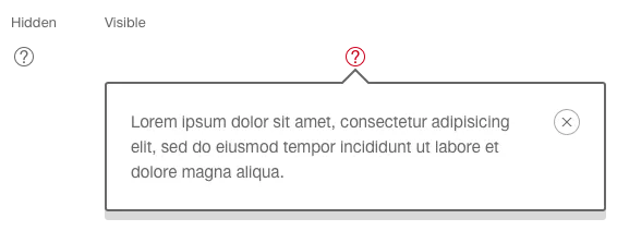
Overlay above the icon
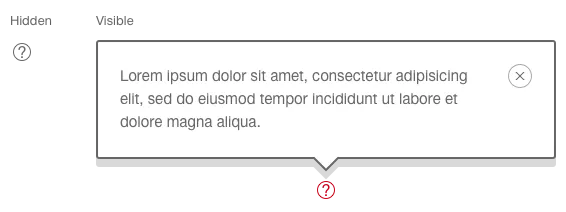
Image of the tooltip with text box above it

Overlay below the icon

Image of the tooltip with text box below it

Specification

DesignCode

Find component

Web (Legacy)

Basics Brand Brand Divider Divider Typografie Typografie Components Accordion Accordion Autocompletion Autocompletion Breadcrumb Breadcrumb Button Button Captcha Captcha Checkbox Checkbox Checkboxpanel Checkboxpanel Datepicker Datepicker Lightbox Lightbox Fileselector Fileselector Ghettobox Ghettobox Link Link Loading Indicator Loading Indicator Mediagallery Mediagallery Mediaslider Mediaslider NBC NBC Notification Notification Pagination Pagination Processflow Processflow Radiobutton Radiobutton Radiobuttonpanel Radiobuttonpanel Searchfield Searchfield Select Select Tab Tab Table Table Tag Tag Textarea Textarea Textexpand Textexpand Textfield Textfield Timefield Timefield Toggle Toggle Tooltip Tooltip Usermenu Usermenu
Imprint Contact Cookie settings