Zur Navigation Zum Inhalt Kontakt Menu Find component Overview Web (Legacy) Principles Foundation Accessibility Design System Guidelines Deutsch Français Italiano English Our design principles User-centred Recognisable Inclusive Reduced Holistic Self-explanatory Task-oriented Appropriate SBB Brand portal Logo Digital clock Rights of use Base colors Functional colors Off brand colors Icons Timetable icons Pictograms About accessibility Über diesen Guide Contact Further information Product Owner User Research Interaction Design Visual Design Development Content Design Testing What is a design system? Designing Coding FAQ Help Process Contribution Contact Overview Base Components Overview Base Components Overview Base Components Overview Design Tokens Components Overview Base Informationen Sense & Purpose Community Assets Instructions Power-Apps Digital banner ads SAP Design Guidelines App Icons
Find component

Web (Legacy)

Basics Brand

Brand

Divider

Divider

Icon

Icon

Images

Images

Text

Text

Typografie

Typografie

Components Accordion

Accordion

Autocompletion

Autocompletion

Breadcrumb

Breadcrumb

Button

Button

Captcha

Captcha

Checkbox

Checkbox

Checkboxpanel

Checkboxpanel

Datepicker

Datepicker

Lightbox

Lightbox

Fileselector

Fileselector

Ghettobox

Ghettobox

Link

Link

Loading Indicator

Loading Indicator

Mediagallery

Mediagallery

Mediaslider

Mediaslider

NBC

NBC

Notification

Notification

Pagination

Pagination

Processflow

Processflow

Radiobutton

Radiobutton

Radiobuttonpanel

Radiobuttonpanel

Searchfield

Searchfield

Select

Select

Tab

Tab

Table

Table

Tag

Tag

Textarea

Textarea

Textexpand

Textexpand

Textfield

Textfield

Timefield

Timefield

Toggle

Toggle

Tooltip

Tooltip

Usermenu

Usermenu

Tag Overview

What does the component do?

It categorises a large amount of information.

When should the component be used?

  • For filtering results with lots of categories.
  • In a tag cloud as a link tag to use jump points to a new category page.

Rules

  • A tag always has an indicator which shows how many results are behind it.
  • The tag is always positioned on the left in content pages and is always centred in overview pages.
  • The order of the tags is determined editorially.
  • The term in the tag is always single-line (no line breaks) and the tag itself increases in width with the text.
  • If a tag becomes too long for the viewport due to the text, the text is shortened with ‘…’.
States and variants

States

The component has the following states:

  • Active (Default)
  • Inactive
  • Hover active
  • Hover inactive

Variants

Filter tag

Image of the filter tag used as filter

  • The status of the tags in the filter is active or inactive.
  • When a tag is clicked, the status concerned toggles to the other status and influences the filter result.
  • A tag ‘all’ is always inserted within the filter. If this filter tag is clicked, it changes to the active status and all other tags in the filter are set to the inactive status.

Example:

Image of an example for filter tag

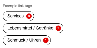
Link tag

Image of the filter tag used as link

  • Link tags only have the active status.
  • Clicking on the tag takes the user to the relevant category page.

Beispiel:

Image of an example for link tag

Specification

DesignCode

Imprint Contact Cookie settings