Zur Navigation Zum Inhalt Kontakt Menu Find component Overview Web (Legacy) Principles Foundation Accessibility Design System Guidelines Deutsch Français Italiano English Our design principles User-centred Recognisable Inclusive Reduced Holistic Self-explanatory Task-oriented Appropriate SBB Brand portal Logo Digital clock Rights of use Base colors Functional colors Off brand colors Icons Timetable icons Pictograms About accessibility Über diesen Guide Contact Further information Product Owner User Research Interaction Design Visual Design Development Content Design Testing What is a design system? Designing Coding FAQ Help Process Contribution Contact Overview Base Components Overview Base Components Overview Base Components Overview Design Tokens Components Overview Base Informationen Sense & Purpose Community Assets Instructions Power-Apps Digital banner ads SAP Design Guidelines App Icons
Find component

Web (Legacy)

Basics Brand

Brand

Divider

Divider

Icon

Icon

Images

Images

Text

Text

Typografie

Typografie

Components Accordion

Accordion

Autocompletion

Autocompletion

Breadcrumb

Breadcrumb

Button

Button

Captcha

Captcha

Checkbox

Checkbox

Checkboxpanel

Checkboxpanel

Datepicker

Datepicker

Lightbox

Lightbox

Fileselector

Fileselector

Ghettobox

Ghettobox

Link

Link

Loading Indicator

Loading Indicator

Mediagallery

Mediagallery

Mediaslider

Mediaslider

NBC

NBC

Notification

Notification

Pagination

Pagination

Processflow

Processflow

Radiobutton

Radiobutton

Radiobuttonpanel

Radiobuttonpanel

Searchfield

Searchfield

Select

Select

Tab

Tab

Table

Table

Tag

Tag

Textarea

Textarea

Textexpand

Textexpand

Textfield

Textfield

Timefield

Timefield

Toggle

Toggle

Tooltip

Tooltip

Usermenu

Usermenu

Searchfield Overview

What does the component do?

It is used for the entry of simple search requests.

When should the component be used?

When the user has to be provided with the option of entering a search request using one or several (partial) words.

Rules

  • The search field always has a placeholder indicating which search terms are accepted.
  • As soon as the focus is in the search field, the user can be shown up to nine most frequently searched-for keywords if required.
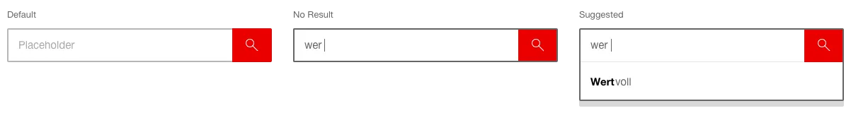
  • After the second letter has been typed in, four possible results (auto-suggest mechanism) appear.
  • The matches of the letters entered are shown in bold in the hits.
  • If there are no hits, the most frequent keywords continue to appear alone. If no frequent keywords are defined and there are no hits, the auto-suggest box is hidden.
  • Auto-suggest terms that are too long are cut off and marked with “...”.
  • If web codes are permitted as an entry, the auto-suggest mechanism is deactivated.
  • The search is started by clicking on the ‘search’ button (magnifying glass) or by using the Enter key.
  • If the text becomes longer than the width of the entry field during the entry, the text entered is pushed to the left so that what is currently being written can always be seen.
  • After leaving the search field with a long text, this is cut off at the end and designated with “…”.
  • If you click on an auto-suggest term from the list, you will navigate directly to this page.
States and variants

States

The component has the following states:

  • Default
  • No Result
  • Suggested

Variants

Default

  • The number of the auto-suggest terms displayed has to be defined for each case.
  • A maximum of ten entries is recommended.

In the header

The component has the following states:

  • Default
  • Hover
  • Focused
  • No Result
  • Suggested

Darstellung der Komponente Suchfeld integriert im Header

  • The entry mask opens when ‘search’ is clicked on.
  • After the search has been started, the entry mask is hidden again and only the ‘search’ link is displayed.
  • This module can only be inserted in the header.
  • When the search is triggered, the results are displayed on a separate page.
  • When typing a maximum of four auto-suggest proposals are shown.

Specification

DesignCode

Imprint Contact Cookie settings