Zur Navigation Zum Inhalt Kontakt Menu Find component Overview Web (Legacy) Principles Foundation Accessibility Design System Guidelines Deutsch Français Italiano English Our design principles User-centred Recognisable Inclusive Reduced Holistic Self-explanatory Task-oriented Appropriate SBB Brand portal Logo Digital clock Rights of use Base colors Functional colors Off brand colors Icons Timetable icons Pictograms About accessibility Über diesen Guide Contact Further information Product Owner User Research Interaction Design Visual Design Development Content Design Testing What is a design system? Designing Coding FAQ Help Process Contribution Contact Overview Base Components Overview Base Components Overview Base Components Overview Design Tokens Components Overview Base Informationen Sense & Purpose Community Assets Instructions Power-Apps Digital banner ads SAP Design Guidelines App Icons
Find component

Web (Legacy)

Basics Brand

Brand

Divider

Divider

Icon

Icon

Images

Images

Text

Text

Typografie

Typografie

Components Accordion

Accordion

Autocompletion

Autocompletion

Breadcrumb

Breadcrumb

Button

Button

Captcha

Captcha

Checkbox

Checkbox

Checkboxpanel

Checkboxpanel

Datepicker

Datepicker

Lightbox

Lightbox

Fileselector

Fileselector

Ghettobox

Ghettobox

Link

Link

Loading Indicator

Loading Indicator

Mediagallery

Mediagallery

Mediaslider

Mediaslider

NBC

NBC

Notification

Notification

Pagination

Pagination

Processflow

Processflow

Radiobutton

Radiobutton

Radiobuttonpanel

Radiobuttonpanel

Searchfield

Searchfield

Select

Select

Tab

Tab

Table

Table

Tag

Tag

Textarea

Textarea

Textexpand

Textexpand

Textfield

Textfield

Timefield

Timefield

Toggle

Toggle

Tooltip

Tooltip

Usermenu

Usermenu

Notification Overview

What does the component do?

It is used to display messages that concern an entire page.

When should the component be used?

  • When a user has triggered an action on a page and should receive feedback from the system.

Rules

  • Notifications only ever appear after an action has been triggered by the user.
  • The width is always the same as the content area.
  • The height is based on the length of the message text.
States and variants

Variants

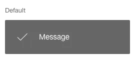
Confirmation

Image of a notification, confirmation

Information

Image of a notification, information

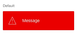
Error

Image of a notification, error

Error with jump marker

Image of a notification, error with jump marker

  • The individual jump markers are separated by a ‘/’.
  • Clicking on a skip marker scrolls directly to the cause of the error.
  • The jump marker target is always on the same page as the notification (no jumping to other pages).

Specification

DesignCode

Imprint Contact Cookie settings