What does the component do?
It makes various information and functions available.
When should the component be used?
To complement content pages.
Rules
- The module is always used in the margin column (on the right).
- Several modules can be positioned beneath one another in the margin column.
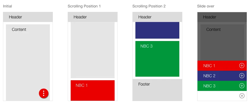
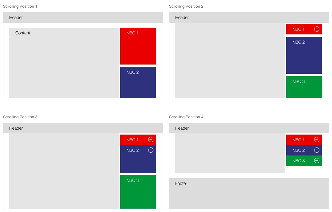
- When scrolling all boxes in the margin column are sticky. The individual boxes are successively minimised as soon as they reach the top edge of the viewport.
- Individual boxes in the scrolled status can be expanded by the user.
- Only one box can ever be expanded in the scrolled status.
States
The Next Best Click container does not have any cross-viewport states as they behave differently. The individual variants also have different forms.
Variants
Action
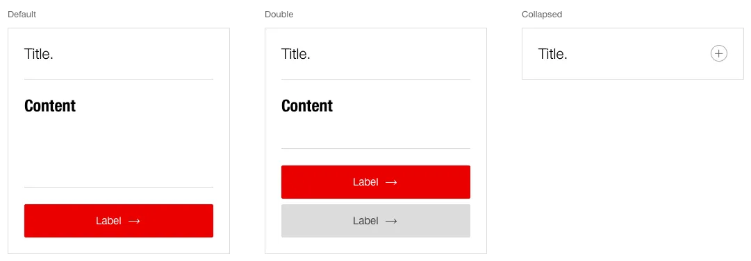
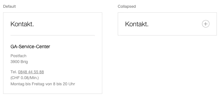
Contact
Link
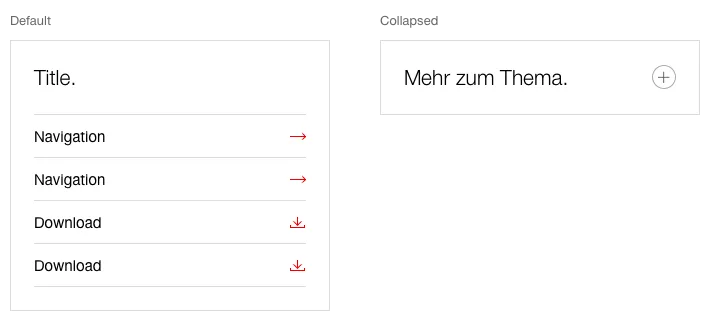
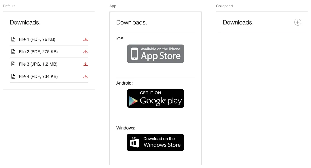
Download
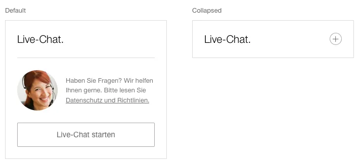
Chat
Behaviour
Desktop (and higher resolutions)
- All Next-Best-Click options are arranged on the content pages in the margin column (right column).
- When scrolling all boxes in the right column are sticky. The individual boxes are successively minimised as soon as they reach the upper edge of the viewport (below the sticky header) and below with already minimised boxes.
- In the minimised status, all boxes are always accessible for the user.
- The user can then open a box (and also close it again).
- Only one box can be opened at the same time in the scrolled status.
- The NBC box remains sticky until the user reaches the end of the content area. If the user continues to scroll down, the boxes with the content scroll away upwards.
- If the user then scrolls upwards again, the NBC box also reappears and is sticky again.
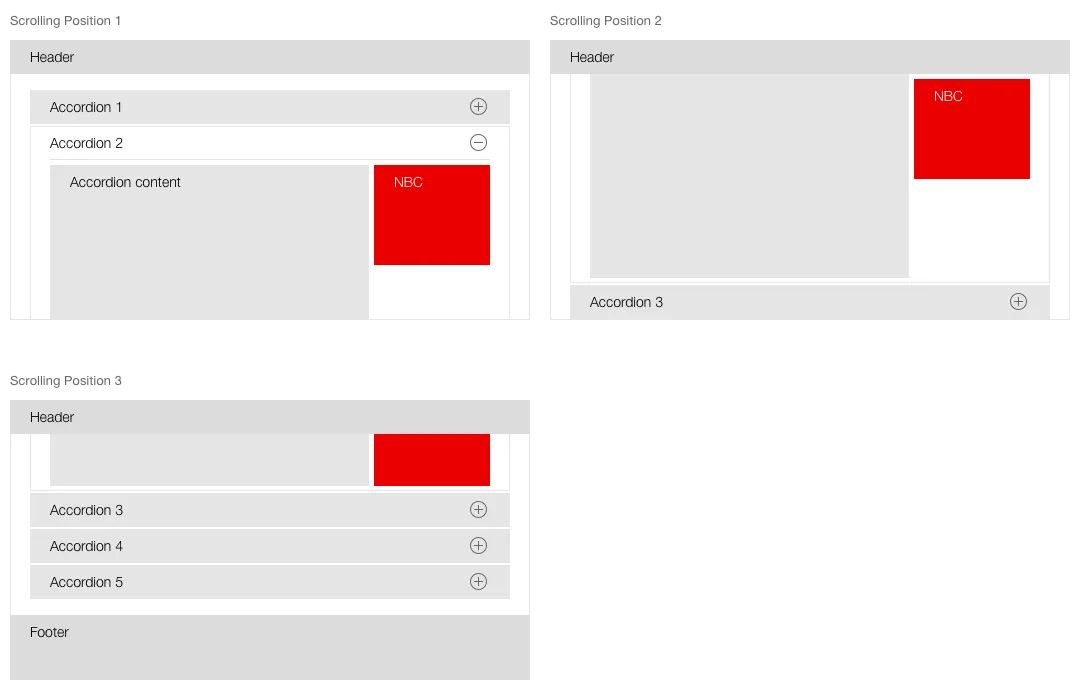
Special case: NBC box within an accordion
- A NBC box is never minimised when used within an
accordion . - Only one NBC box can be inserted into an accordion.
- When scrolling, the NBC box remains sticky on the top edge to the end of the content area of the accordion, after which the box continues to be scrolled with the content.
Tablet
- All Next-Best-Click options are always available via the sticky element on the bottom right.
- When clicked, a layer with all NBC modules alongside one another opens in the open status (two-column display)
- The icon in the sticky element then changes into the close button (toggle button).
- In the tablet variant, the NBC boxes at the end of the content area are displayed as redundant (open).
- If the user scrolls into the relevant area (and beyond) the element for opening the NBC layer is hidden.
- If the user scrolls up again, the sticky element also reappears.

Mobile
- All Next-Best-Click options are always accessible via the sticky element in the bottom right.
- When clicked, a layer with all NBC modules opens in closed status.
- Only one module can be opened at a time.
- The icon in the sticky element turns into the close icon (toggle button).
- In the mobile variant, the NBC boxes at the end of the content area are displayed as redundant (open).
- If the user scrolls into the relevant area (and beyond) the element for opening the NBC layer is hidden.
- If the user scrolls up again, the sticky element also reappears.
