Zur Navigation Zum Inhalt Kontakt Menu Find component Overview Web (Legacy) Principles Foundation Accessibility Design System Guidelines Deutsch Français Italiano English Our design principles User-centred Recognisable Inclusive Reduced Holistic Self-explanatory Task-oriented Appropriate SBB Brand portal Logo Digital clock Rights of use Base colors Functional colors Off brand colors Icons Timetable icons Pictograms About accessibility Über diesen Guide Contact Further information Product Owner User Research Interaction Design Visual Design Development Content Design Testing What is a design system? Designing Coding FAQ Help Process Contribution Contact Overview Base Components Overview Base Components Overview Base Components Overview Design Tokens Components Overview Base Informationen Sense & Purpose Community Assets Instructions Power-Apps Digital banner ads SAP Design Guidelines App Icons
Find component

Web (Legacy)

Basics Brand

Brand

Divider

Divider

Icon

Icon

Images

Images

Text

Text

Typografie

Typografie

Components Accordion

Accordion

Autocompletion

Autocompletion

Breadcrumb

Breadcrumb

Button

Button

Captcha

Captcha

Checkbox

Checkbox

Checkboxpanel

Checkboxpanel

Datepicker

Datepicker

Lightbox

Lightbox

Fileselector

Fileselector

Ghettobox

Ghettobox

Link

Link

Loading Indicator

Loading Indicator

Mediagallery

Mediagallery

Mediaslider

Mediaslider

NBC

NBC

Notification

Notification

Pagination

Pagination

Processflow

Processflow

Radiobutton

Radiobutton

Radiobuttonpanel

Radiobuttonpanel

Searchfield

Searchfield

Select

Select

Tab

Tab

Table

Table

Tag

Tag

Textarea

Textarea

Textexpand

Textexpand

Textfield

Textfield

Timefield

Timefield

Toggle

Toggle

Tooltip

Tooltip

Usermenu

Usermenu

Mediaslider Overview

What does the component do?

It is used to display two to six images/videos in a list.

When should the component be used?

In a list of several images/videos.

Rules

  • Two to six images may be used in the slider.
  • The ‘gallery’ module is used for more than six images.
  • The images/videos in the slider never rotate independently.
  • The first image is always selected in the default status.
  • When hovering over a video or GIF entry, the middle part is also shown as well as the start of the video.
  • When hovering the element within the container is increased to 110% (masked).
  • The next/previous element can be displayed by swiping on touch devices.
  • The number of slider elements is indicated by the dots below the container.
  • The underlying slider element is displayed directly if one of these dots is clicked on.
  • The last and first element can be combined (carousel function).
States and variants

States

The component has the following states:

  • Default

Variants

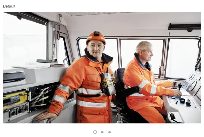
Default

Image of the media slider, default

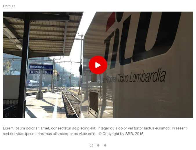
With additional text

Image of the media slider, with additional text

Specification

Design

Imprint Contact Cookie settings