Zur Navigation Zum Inhalt Kontakt Menu Find component Overview Web (Legacy) Principles Foundation Accessibility Design System Guidelines Deutsch Français Italiano English Our design principles User-centred Recognisable Inclusive Reduced Holistic Self-explanatory Task-oriented Appropriate SBB Brand portal Logo Digital clock Rights of use Base colors Functional colors Off brand colors Icons Timetable icons Pictograms About accessibility Über diesen Guide Contact Further information Product Owner User Research Interaction Design Visual Design Development Content Design Testing What is a design system? Designing Coding FAQ Help Process Contribution Contact Overview Base Components Overview Releases Design Tokens Komponenten Overview Base Informationen Overview Base Components Sense & Purpose Community Assets Instructions Power-Apps Digital banner ads SAP Design Guidelines App Icons Mediagallery Overview

What does the component do?

It is used to display seven or more images/videos in a list.

When should the component be used?

In a list of several images/videos.

Rules

  • Seven or more images/videos may be used.
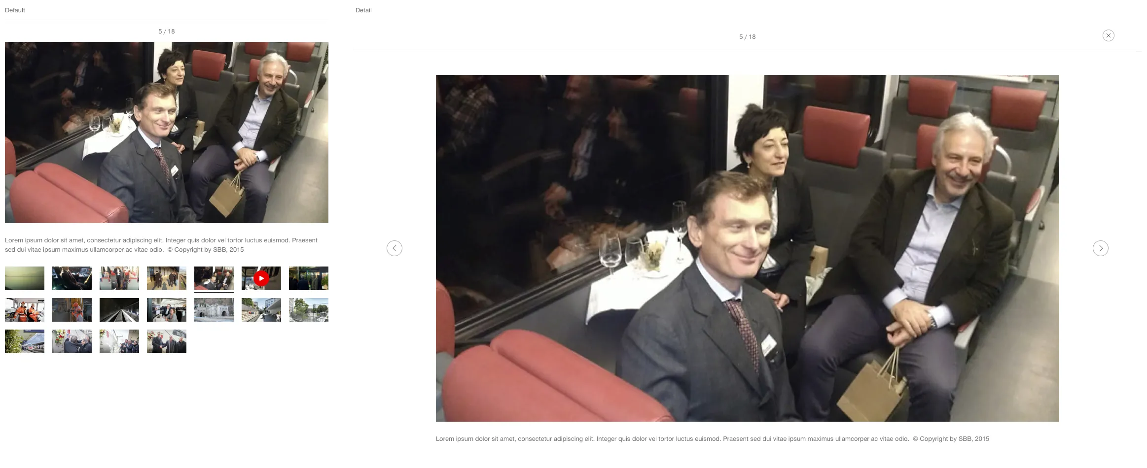
  • A text can be added to the image/video displayed. This is always below the image/video.
  • A status line is displayed above the gallery pointing to the ‘image shown/total number of images’.
  • The gallery shows a preview of the images/videos not selected as thumbs.
  • The entry is selected by clicking on a thumb.
  • In the mobile view, three images from the gallery are shown beneath one another at the same time. The ‘show more’ button downloads and displays three more images.
  • The image/video container always has the basic format 16:9.
  • Content that differs from this format appears centred (horizontal and vertical).
  • In the default status, the first image is always selected and shown in large format.
  • The images/videos never rotate automatically.
  • Hovering over a video or GIF entry shows the middle part as well as the start of the video.
  • Clicking on the middle part of images shows the image selected in large format in a lightbox.
  • When hovering, the element within the container increases to 110% (masked).
  • The next/previous element can be displayed by swiping on touch devices.
States and variants

States

The component has the following states:

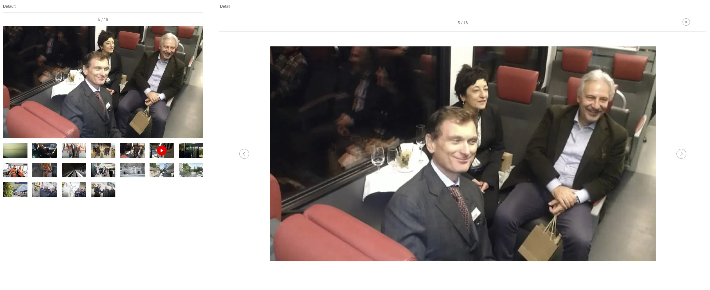
  • Default
  • Detail

Variants

Default

Image of the media gallery, default

With additional text

Image of the media gallery, with additional text

Specification

Design

Find component

Web (Legacy)

Basics Brand Brand Divider Divider Icon Icon Images Images Text Text Typografie Typografie Components Accordion Accordion Autocompletion Autocompletion Breadcrumb Breadcrumb Button Button Captcha Captcha Checkbox Checkbox Checkboxpanel Checkboxpanel Datepicker Datepicker Lightbox Lightbox Fileselector Fileselector Ghettobox Ghettobox Link Link Loading Indicator Loading Indicator Mediagallery Mediagallery Mediaslider Mediaslider NBC NBC Notification Notification Pagination Pagination Processflow Processflow Radiobutton Radiobutton Radiobuttonpanel Radiobuttonpanel Searchfield Searchfield Select Select Tab Tab Table Table Tag Tag Textarea Textarea Textexpand Textexpand Textfield Textfield Timefield Timefield Toggle Toggle Tooltip Tooltip Usermenu Usermenu
Imprint Contact Cookie settings