Zur Navigation Zum Inhalt Kontakt Menu Find component Overview Web (Legacy) Principles Foundation Accessibility Design System Guidelines Deutsch Français Italiano English Our design principles User-centred Recognisable Inclusive Reduced Holistic Self-explanatory Task-oriented Appropriate SBB Brand portal Logo Digital clock Rights of use Base colors Functional colors Off brand colors Icons Timetable icons Pictograms About accessibility Über diesen Guide Contact Further information Product Owner User Research Interaction Design Visual Design Development Content Design Testing What is a design system? Designing Coding FAQ Help Process Contribution Contact Overview Base Components Overview Releases Design Tokens Komponenten Overview Base Informationen Overview Base Components Sense & Purpose Community Assets Instructions Power-Apps Digital banner ads SAP Design Guidelines App Icons Typografie

Font

The company font ‘SBB Web’ is used as a web font and in the styles Thin, Light, Roman and Bold.

Style

The font styles defined here form the base of web applications and their components. If others are used, a clear hierarchy must be ensured as well as sufficient contrast and appropriate line/paragraph spacing. The SBB colors apply to font colors.

Heading H1

Image of the H1 style
* Only once per page.{.lead} * Never contains a link.{.lead} * The text of the heading should be the same as the title in the navigation.{.lead}

Heading H2

Image of the H2 style
* It is generally left-justified.{.lead} * If the H2 title is used for additional information directly beneath a H1 title, this may also be centred.{.lead} * Cannot be used without a preceding H1 title.{.lead}

Heading H3

Image of the H3 style
* Alignment is left-justified.{.lead} * It cannot be used without a preceding H2 title.{.lead}

Heading H4

Image of the H4 style
* Alignment is left-justified. * It cannot be used without a preceding H3 title.{.lead}

Lead

Image of the lead style

Body copy

Image of the body copy style

Link

Image of the link style
* Is used as a standard link within texts.{.lead} * Further information about links can be found at link.{.lead}

Subtext

Image of the subtext style

Table header

Image of the table header style
* The definition of the table as a component can be found under table.{.lead}

Table data

Image of the table data style
* The definition of the table as a component can be found under table.{.lead}

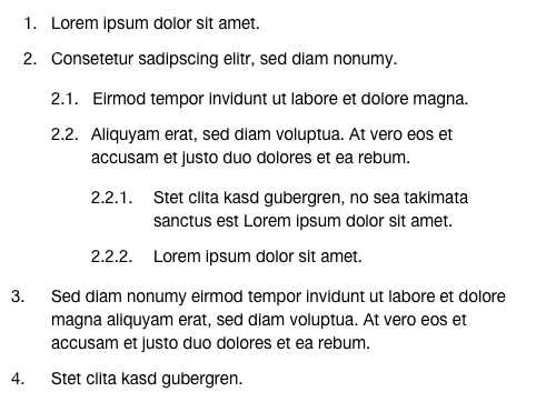
Structured list

Image of the structured list style
* The list has a maximum of three hierarchy levels.{.lead} * Simple links are permitted.{.lead} * Bold, superscript and subscript numbers are permitted.{.lead} * Short descriptions should be defined for a list entry (no four-line texts) whenever possible.{.lead}

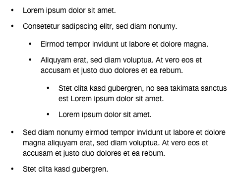
Unstructured list

Image of the unstructured list style
* The list has a maximum of three hierarchy levels.{.lead} * Simple links are permitted.{.lead} * Bold, superscript and subscript numbers are permitted.{.lead} * Short descriptions should be defined for a list entry (no four-line texts) whenever possible.{.lead}

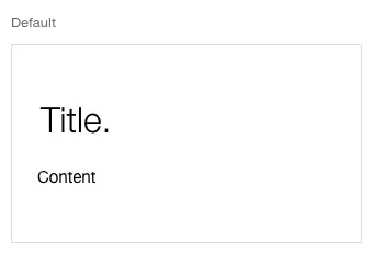
Fieldset simple

Image of the fieldset style, simple

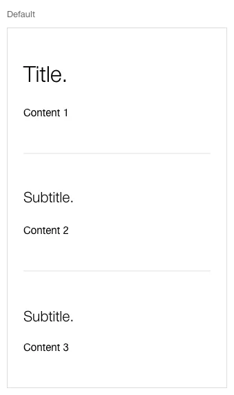
Fieldset complex

Image of the fieldset style, complex

Specification

DesignCode

Find component

Web (Legacy)

Basics Brand Brand Divider Divider Icon Icon Images Images Text Text Typografie Typografie Components Accordion Accordion Autocompletion Autocompletion Breadcrumb Breadcrumb Button Button Captcha Captcha Checkbox Checkbox Checkboxpanel Checkboxpanel Datepicker Datepicker Lightbox Lightbox Fileselector Fileselector Ghettobox Ghettobox Link Link Loading Indicator Loading Indicator Mediagallery Mediagallery Mediaslider Mediaslider NBC NBC Notification Notification Pagination Pagination Processflow Processflow Radiobutton Radiobutton Radiobuttonpanel Radiobuttonpanel Searchfield Searchfield Select Select Tab Tab Table Table Tag Tag Textarea Textarea Textexpand Textexpand Textfield Textfield Timefield Timefield Toggle Toggle Tooltip Tooltip Usermenu Usermenu
Imprint Contact Cookie settings