Principles Foundation Accessibility Design System Guidelines Deutsch Français Italiano English Our design principles User-centred Recognisable Inclusive Reduced Holistic Self-explanatory Task-oriented Appropriate SBB Brand portal Logo Digital clock Rights of use Base colors Additional colors Off brand colors Icons Timetable icons Pictograms About accessibility Über diesen Guide Contact Further information Product Owner User Research Interaction Design Visual Design Development Content Design Testing What is a design system? Designing Coding FAQ Help Process Contribution Contact Overview Base Components Overview Releases Design Tokens Components Overview Base Informations Overview Base Components Overview App Icons Power-Apps Digital banner ads SAP Design Guidelines AI Design: Basics Usermenu Overview

What does the component do?

  • It is used for login/logout, role selection and provides the logged-in user with a menu with comprehensive functions.

When should the component be used?

  • Whenever the user should be able to log into an application.

Rules

  • The user menu is always positioned in the header and can only be used there.
  • The extended user menu can be closed by clicking outside of the dropdown.
  • The last menu item in the list is always ‘log out’.
  • Icons can optionally be used in menu items.
Variants

States

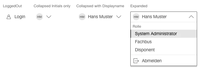
The component has the following states:

  • LoggedOut
  • Collapsed
  • Expanded
  • Hover

Variants

Default

Image of a user menu


Role selection

Image of a user menu with role selection


Specifications

DesignCode