Principles Foundation Accessibility Design System Guidelines Deutsch Français Italiano English Our design principles User-centred Recognisable Inclusive Reduced Holistic Self-explanatory Task-oriented Appropriate SBB Brand portal Logo Digital clock Rights of use Base colors Additional colors Off brand colors Icons Timetable icons Pictograms About accessibility Über diesen Guide Contact Further information Product Owner User Research Interaction Design Visual Design Development Content Design Testing What is a design system? Designing Coding FAQ Help Process Contribution Contact Overview Base Components Overview Releases Design Tokens Components Overview Base Informations Overview Base Components Overview App Icons Power-Apps Digital banner ads SAP Design Guidelines AI Design: Basics Tree Overview

What does the component do?

  • Displays hierarchically structured data in a tree structure.

When should the component be used?

  • To display and select elements in a hierarchical structure.

Rules

  • When using a tree as a navigation component, it makes sense not to use too many hierarchy levels (recommendation max. 3).
  • When using an tree to display data structures (e.g. a dossier, analogous to a file browser), it depends on the application how many hierarchy levels are needed.
  • The icon as a supplement to the text is optional.
Variants

States

The component has the following states:

  • Collapsed
  • Expanded
  • Default
  • Hover
  • Selected

Variants

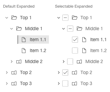
Default

Image of a tree, default


Selectable

Image of a tree, selectable


Example application

Image of an example of a tree


Specifications

Design