What does the component do?
- Structured display of data within a table.
When should the component be used?
- It is used for displaying data, not for structuring content.
- Tables should be structured so that they grow vertically (lines) when data sets are added.
Rules
- Table cells may contain just information (e.g. text, person, status display, icon) or interaction elements (e.g. text field, select, button).
- Every column must have a header (including text or icon).
- Headers can contain subtitles in addition to the title.
- Header and line content may be left-aligned, right-aligned or centred within the table cell: Text left-aligned, icons centred, numbers right-aligned
- Units of measurement in content are ideally entered on the second line of the column header. Alternatively, they can appear directly next to the column header name in round brackets.
- Horizontal scrolling should be avoided as far as possible.
- Columns can be put into logical groups. There is no dividing line between grouped columns.
- Large amounts of data can be divided up using
pagination . Alternatively, infinite scrolling can be used if required. - Keyboard operation: between the lines can be navigated using the arrow keys (up, down).
States
The component has the following states:
- Default
- Hover
- Active
Variants
Default

Sortable
This variant has the following states:
- Unsorted
- Sorted

Groupable

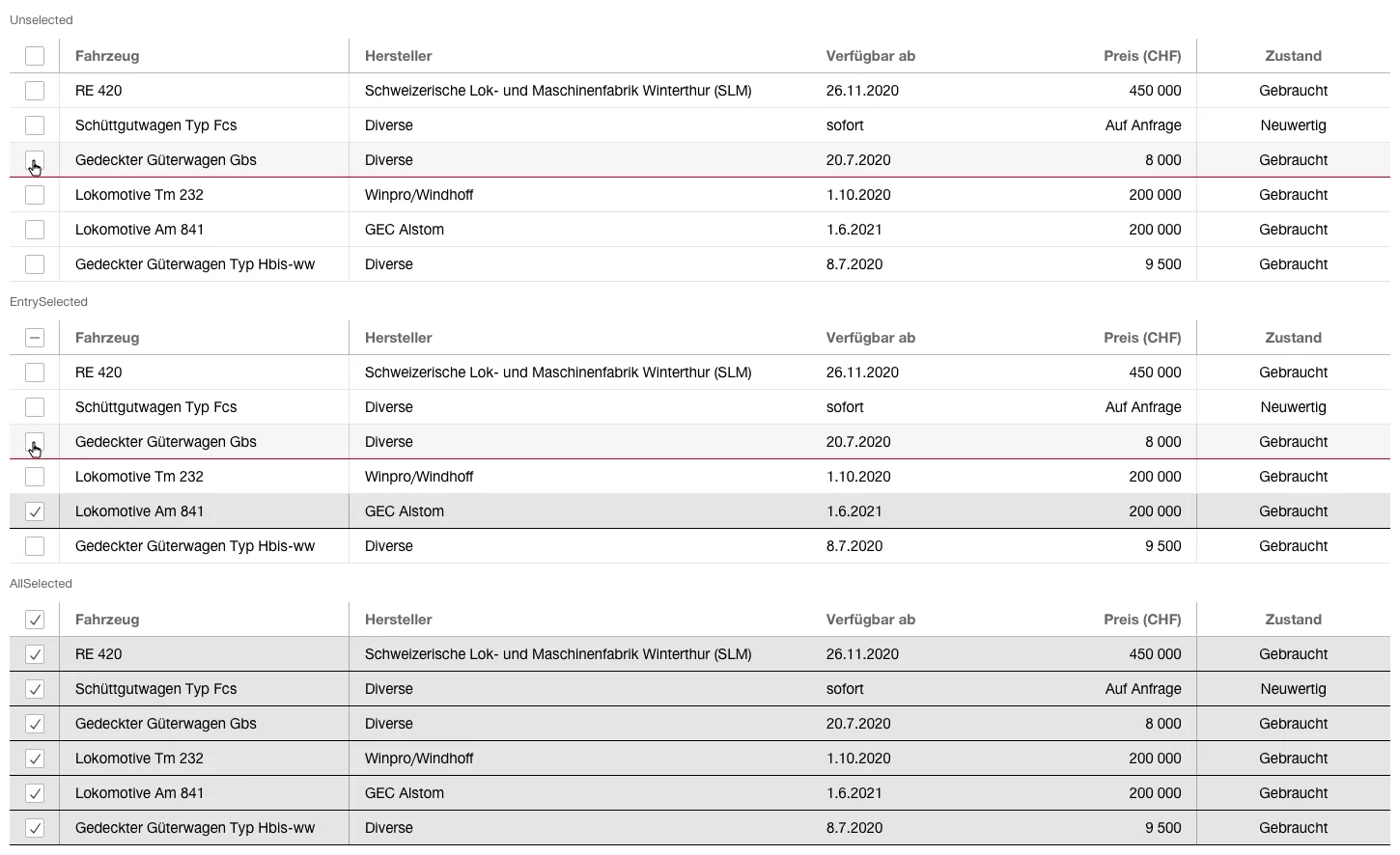
Selectable
This variant has the following states:
- Unselected
- EntrySelected
- AllSelected

Filterable
This variant has the following states:
- Unfiltered
- Filtered

- The individual columns can be filtered according to content type (text, date, value, etc.) using the appropriate components (
Textfield ,Datepicker ,Select , etc.). - A separate
Filter can also be used to restrict large amounts of data. - It is advisable to display the number of filtered items to the users, e.g. "34 out of 3890".
Inline actions

- When hovering over rows or focusing them using tab navigation via the keyboard, actions can be offered on the elements.
- The actions are offered by using
icon button . Depending on the use case, it is decided in which column (first or last column) they are placed. There they overlay the existing content. - A maximum of 3 actions should be offered. If more are needed, a
contextmenu should be used. - Keyboard operation: if the focus is on a row in the table, it's possible to navigate to the actions using 'Tab'-key of the keyboard.
Batch actions

- Batch actions can be offered on selection of (multiple) elements.
- All versions of
buttons can be used for the actions. - The primary action is on the left, the secondary actions are on the right.
- A maximum of 3 actions should be offered. If more are needed, a
contextmenu should be used. - The batch actions are placed above the table on the right.
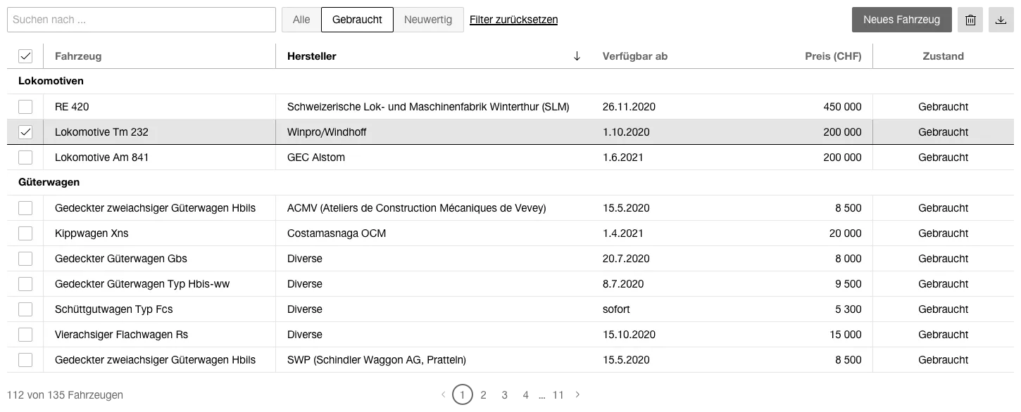
Example application
