Principles Foundation Accessibility Design System Guidelines Deutsch Français Italiano English Our design principles User-centred Recognisable Inclusive Reduced Holistic Self-explanatory Task-oriented Appropriate SBB Brand portal Logo Digital clock Rights of use Base colors Functional colors Off brand colors Icons Timetable icons Pictograms About accessibility Über diesen Guide Contact Further information Product Owner User Research Interaction Design Visual Design Development Content Design Testing What is a design system? Designing Coding FAQ Help Process Contribution Contact Overview Base Components Overview Releases Design Tokens Components Overview Base Informationen Overview Base Components Sense & Purpose Community Assets Instructions App Icons Power-Apps Digital banner ads SAP Design Guidelines Slider

Overview

What does the component do?

  • Allows a quick selection of a value within a range of values.

When should the component be used?

  • To quickly select a value within a range of values.

Rules

  • The textfield for displaying the currently selected value is optional.
  • The display of min and max values is optional.
  • The value can be changed using drag & drop or a click on the slider bar.
States and variants

States

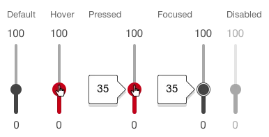
The component has the following states:

  • Default
  • Hover
  • Pressed
  • Focused
  • Disabled

Variants

Continuous

Image of a slider, continuous, horizontal
Image of a slider, continuous, vertical
  • This variant should not be used for very large or very small value ranges, but above all for imprecise value ranges (e.g. "quiet" - "loud", "little" - "much").

Discrete

Image of a slider, discrete, horizontal
Image of a slider, discrete, vertical

Value range

Image of a slider, value range

Single value

Image of a slider, single value

Specifications

Design

Imprint Contact Data privacy Cookie settings