Zur NavigationZum InhaltKontaktMenuFind componentOverview LeanFind component
More Info
Brand
Display
FigmaCode
More Info
Divider
Display
FigmaCode
More Info
Icon
Display
FigmaCode
More Info
Text
Display
FigmaCode
More Info
Typograhpy
Basics
FigmaCode
More Info
Accordion
Container
FigmaCode
More Info
Autocompletion
Form
FigmaCode
More Info
Breadcrumb
Navigation
FigmaCode
More Info
Button
Action
FigmaCode
More Info
Buttonbar
Action
FigmaCode
More Info
Checkbox
Form
FigmaCode
More Info
Checkboxpanel
Form
FigmaCode
More Info
Chip
Form
FigmaCode
More Info
Contextmenu
Action
FigmaCode
More Info
Datepicker
Form
FigmaCode
More Info
Dialog
Container
FigmaCode
More Info
Fieldset
Form
FigmaCode
More Info
Fileselector
Form
FigmaCode
More Info
Filter
Form
FigmaCode
More Info
Header
Navigation
FigmaCode
More Info
Link
Action
FigmaCode
More Info
Loadingindicator
Indicator
FigmaCode
More Info
Menuitem
ActionNavigation
FigmaCode
More Info
Notification
Indicator
FigmaCode
More Info
Pagination
NavigationIndicator
FigmaCode
More Info
Processflow
NavigationIndicator
FigmaCode
More Info
Radiobutton
Form
FigmaCode
More Info
Radiobuttonpanel
Form
FigmaCode
More Info
Select
Form
FigmaCode
More Info
Sidebar
Navigation
FigmaCode
More Info
Slider
Form
FigmaCode
More Info
Status
Indicator
FigmaCode
More Info
Tab
ContainerNavigation
FigmaCode
More Info
Table
Display
FigmaCode
More Info
Tag
Form
FigmaCode
More Info
Textarea
Form
FigmaCode
More Info
Textexpand
Indicator
FigmaCode
More Info
Textfield
Form
FigmaCode
More Info
Timefield
Form
FigmaCode
More Info
Toggle
Form
FigmaCode
More Info
Tooltip
Container
FigmaCode
More Info
Tree
Navigation
FigmaCode
More Info
Usermenu
ActionNavigation
FigmaCode
No search results were found.
Try using different or fewer search terms.
PrinciplesFoundationAccessibilityDesign SystemGuidelinesDeutschFrançaisItalianoEnglishOur design principlesUser-centredRecognisableInclusiveReducedHolisticSelf-explanatoryTask-orientedAppropriateSBB Brand portalLogoDigital clockRights of useBase colorsAdditional colorsOff brand colorsIconsTimetable iconsPictogramsAbout accessibilityÜber diesen GuideContactFurther informationProduct OwnerUser ResearchInteraction DesignVisual DesignDevelopmentContent DesignTestingWhat is a design system?DesigningCodingFAQHelpProcessContributionContactOverviewBaseComponentsOverviewReleasesDesign TokensComponentsOverviewBaseInformationsOverviewBaseComponentsOverviewApp IconsPower-AppsDigital banner adsSAP Design GuidelinesAI Design: BasicsSidebar Overview
What does the component do?
Provides direct access to contents and functions of applications or parts of applications.
When should the component be used?
For structuring and direct navigation to contents and functions.
Rules
Behaviour
On large screens (desktop and larger), the content area is reduced in width when the sidebar is expanded. For smaller screens (tablet, mobile), the content is covered by the expanded sidebar.
Layout
The height of the navigation bar corresponds to the height of the complete content area.
Variants
Variants
Plain
This variant has following states:
Default
The menu items can be divided into categories / areas.
For the categories you can choose between accordion and fieldset when using the sidebar.
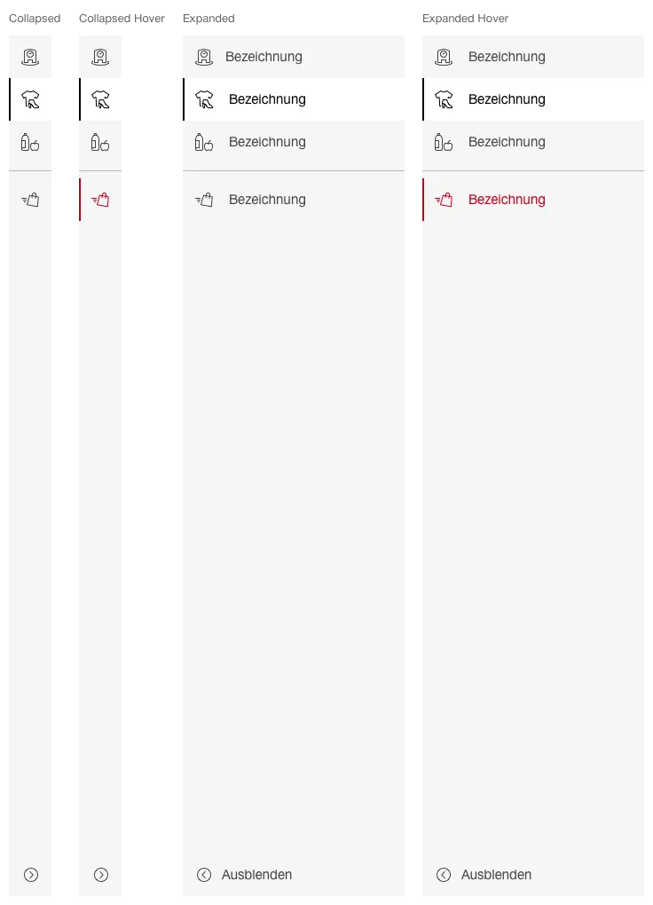
Icon bar
This variant has following states:
Collapsed
Collapsed Hover
Expanded
Expanded Hover
The default state (collapsed, expanded) can be defined per application.
If required, the navigation points can be grouped visually using separators.
By default, the first (top) navigation point should be active.
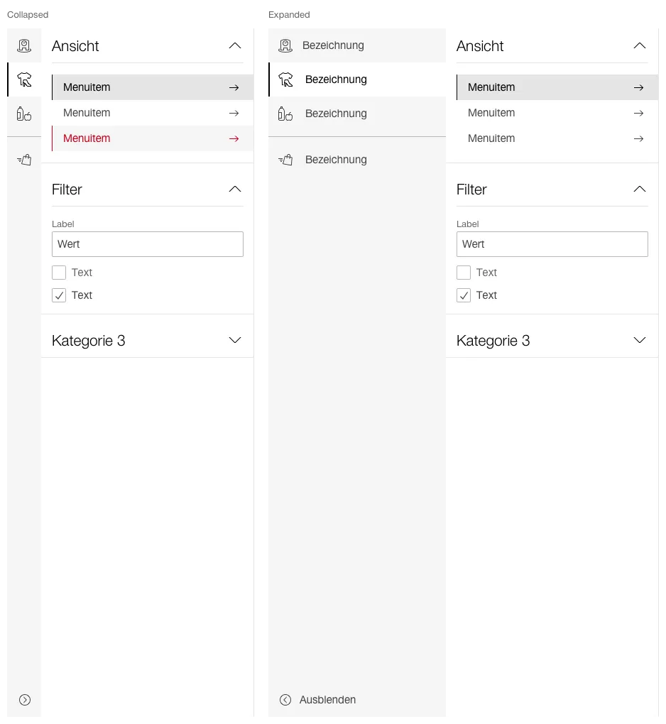
Submenu
This variant has following states:
Collapsed
Expanded
The default state (collapsed, expanded) can be defined per application.
The menu items can be divided into categories / areas.
For the categories you can choose between accordion and fieldset when using the sidebar.