Zur NavigationZum InhaltKontaktMenuFind componentOverview LeanFind component
More Info
Brand
Display
FigmaCode
More Info
Divider
Display
FigmaCode
More Info
Icon
Display
FigmaCode
More Info
Text
Display
FigmaCode
More Info
Typograhpy
Basics
FigmaCode
More Info
Accordion
Container
FigmaCode
More Info
Autocompletion
Form
FigmaCode
More Info
Breadcrumb
Navigation
FigmaCode
More Info
Button
Action
FigmaCode
More Info
Buttonbar
Action
FigmaCode
More Info
Checkbox
Form
FigmaCode
More Info
Checkboxpanel
Form
FigmaCode
More Info
Chip
Form
FigmaCode
More Info
Contextmenu
Action
FigmaCode
More Info
Datepicker
Form
FigmaCode
More Info
Dialog
Container
FigmaCode
More Info
Fieldset
Form
FigmaCode
More Info
Fileselector
Form
FigmaCode
More Info
Filter
Form
FigmaCode
More Info
Header
Navigation
FigmaCode
More Info
Link
Action
FigmaCode
More Info
Loadingindicator
Indicator
FigmaCode
More Info
Menuitem
ActionNavigation
FigmaCode
More Info
Notification
Indicator
FigmaCode
More Info
Pagination
NavigationIndicator
FigmaCode
More Info
Processflow
NavigationIndicator
FigmaCode
More Info
Radiobutton
Form
FigmaCode
More Info
Radiobuttonpanel
Form
FigmaCode
More Info
Select
Form
FigmaCode
More Info
Sidebar
Navigation
FigmaCode
More Info
Slider
Form
FigmaCode
More Info
Status
Indicator
FigmaCode
More Info
Tab
ContainerNavigation
FigmaCode
More Info
Table
Display
FigmaCode
More Info
Tag
Form
FigmaCode
More Info
Textarea
Form
FigmaCode
More Info
Textexpand
Indicator
FigmaCode
More Info
Textfield
Form
FigmaCode
More Info
Timefield
Form
FigmaCode
More Info
Toggle
Form
FigmaCode
More Info
Tooltip
Container
FigmaCode
More Info
Tree
Navigation
FigmaCode
More Info
Usermenu
ActionNavigation
FigmaCode
No search results were found.
Try using different or fewer search terms.
PrinciplesFoundationAccessibilityDesign SystemGuidelinesDeutschFrançaisItalianoEnglishOur design principlesUser-centredRecognisableInclusiveReducedHolisticSelf-explanatoryTask-orientedAppropriateSBB Brand portalLogoDigital clockRights of useBase colorsAdditional colorsOff brand colorsIconsTimetable iconsPictogramsAbout accessibilityÜber diesen GuideContactFurther informationProduct OwnerUser ResearchInteraction DesignVisual DesignDevelopmentContent DesignTestingWhat is a design system?DesigningCodingFAQHelpProcessContributionContactOverviewBaseComponentsOverviewReleasesDesign TokensComponentsOverviewBaseInformationsOverviewBaseComponentsOverviewApp IconsPower-AppsDigital banner adsSAP Design GuidelinesAI Design: BasicsSelect Overview
What does the component do?
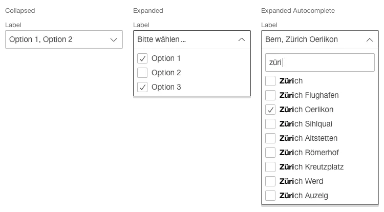
It is used for the selection of one or more options from a pre-defined list.
When should the component be used?
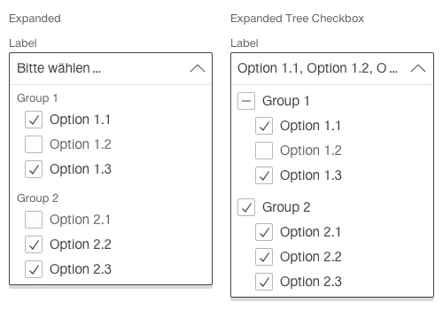
For the selection of several options (selection of single or multiple options) from a list.
If a selection must be made where the entries mutually exclude one another and no default value is to be set (in contrast to the radiobutton element).
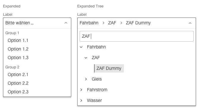
When selection options are to be grouped.
Rules
There must be a choice of at least two options.
The component always has a label.
A question mark in the circle can also be shown – in addition to the label – for detailed explanations. A tooltip opens when this question mark is clicked on.
The text in the select component is always single-line.
If an entry is longer than the available width of the component, the entry’s text is abbreviated with ‘…’.
A pre-selection is not permitted with a mandatory field.
If no selection has been made yet, the component text says “please select …”.