Principles Foundation Accessibility Design System Guidelines Deutsch Français Italiano English Our design principles User-centred Recognisable Inclusive Reduced Holistic Self-explanatory Task-oriented Appropriate SBB Brand portal Logo Digital clock Rights of use Base colors Additional colors Off brand colors Icons Timetable icons Pictograms About accessibility Über diesen Guide Contact Further information Product Owner User Research Interaction Design Visual Design Development Content Design Testing What is a design system? Designing Coding FAQ Help Process Contribution Contact Overview Base Components Overview Releases Design Tokens Components Overview Base Informations Overview Base Components Overview App Icons Power-Apps Digital banner ads SAP Design Guidelines AI Design: Basics Header Overview

What does the component do?

  • It provides the user with accessible information and functions at all times.

When should the component be used?

  • A header must be inserted in any application.

Rules

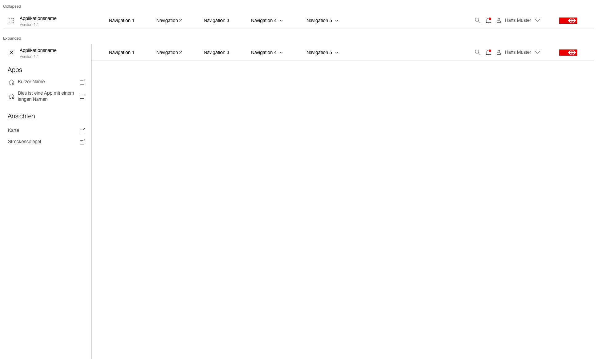
  • The header is composed of app chooser (optional, for application groups), environment banner (except Prod), application name and version, main navigation (if necessary), search (optional), display for notifications (optional), user menu and logo.
  • For Tablet, the main navigation is moved to the burgernavigation. For Mobile additionally the search, notifications and the user menu.
  • The application name is truncated with "..." on mobile if it does not have enough space.
Variants

Variants

Default

This variant has following states:

  • Default

Image of a header


This variant has following states:

  • Collapsed
  • Expanded
  • Hover

Image of a header with submenu


Suite

This variant has following states:

  • Collapsed
  • Expanded

Image of the header in the suite variant to navigate between applicaitons


Specifications

DesignCode