Zur Navigation Zum Inhalt Kontakt Menu Find component Overview Lean Principles Foundation Accessibility Design System Guidelines Deutsch Français Italiano English Our design principles User-centred Recognisable Inclusive Reduced Holistic Self-explanatory Task-oriented Appropriate SBB Brand portal Logo Digital clock Rights of use Base colors Functional colors Off brand colors Icons Timetable icons Pictograms About accessibility Über diesen Guide Contact Further information Product Owner User Research Interaction Design Visual Design Development Content Design Testing What is a design system? Designing Coding FAQ Help Process Contribution Contact Overview Base Components Overview Base Components Overview Base Components Overview Design Tokens Components Overview Base Informationen Sense & Purpose Community Assets Instructions Power-Apps Digital banner ads SAP Design Guidelines App Icons
Find component

Lean

Basics Brand

Brand

Divider

Divider

Icon

Icon

Text

Text

Typografie

Typografie

Components Accordion

Accordion

Autocompletion

Autocompletion

Breadcrumb

Breadcrumb

Button

Button

Buttonbar

Buttonbar

Checkbox

Checkbox

Chip

Chip

Contextmenu

Contextmenu

Datepicker

Datepicker

Dialog

Dialog

Fieldset

Fieldset

Fileselector

Fileselector

Filter

Filter

Header

Header

Link

Link

Loading Indicator

Loading Indicator

Menuitem

Menuitem

Notification

Notification

Pagination

Pagination

Processflow

Processflow

Radiobutton

Radiobutton

Select (Dropdown)

Select (Dropdown)

Sidebar

Sidebar

Slider

Slider

Status

Status

Tab

Tab

Table

Table

Tag

Tag

Textarea

Textarea

Textexpand

Textexpand

Textfield

Textfield

Timefield

Timefield

Toggle

Toggle

Tooltip

Tooltip

Tree

Tree

Usermenu

Usermenu

Filter Overview

What does the component do?

  • Allows you to filter a large amount of information.

When should the component be used?

  • For restricting large amounts of data by selected categories and attributes.

Rules

  • A filter always has an indicator which shows that the filter is active and how many results are displayed in the filtered view, e.g. 100/500 entries.
  • A filter can have different components, e.g. autocomplete, checkboxes, chips, components, radiobuttons, selects (dropdowns), tags, textfields, toggle buttons.
  • It must be possible to reset a filter with an action (e.g. button «Reset filter»).
  • Several filter elements can be selected or deselected.
States and variants

States

The module has the following states:

  • Filtered
  • Not Filtered

Variants

Live Filter

Image of a filter example, live filter

  • The live filter contains the most frequently used filter criteria for finding specific information.
  • When a filter criterion is changed, the results are updated live in the viewport.

Filter Dialog
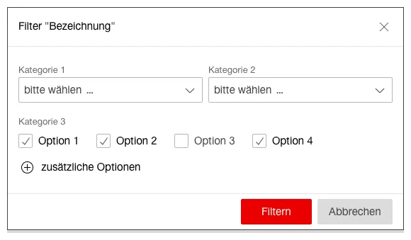
Image of a filter example, dialog

  • The filter dialog is opened by a button or link.
  • The filter dialog contains a large number of filter criteria for finding specific information.
  • If required, further filter criteria can be added to the dialog to provide additional filter elements.
  • Filtering can be confirmed by clicking on «Filtern» (Primary Button) or can be cancelled by clicking on «Abbrechen» (Secondary Button).
  • The results are updated in the viewport after confirming the filter criteria in the dialog box.

Specifications

Design

Imprint Contact Cookie settings