Principles Foundation Accessibility Design System Guidelines Deutsch Français Italiano English Our design principles User-centred Recognisable Inclusive Reduced Holistic Self-explanatory Task-oriented Appropriate SBB Brand portal Logo Digital clock Rights of use Base colors Additional colors Off brand colors Icons Timetable icons Pictograms About accessibility Über diesen Guide Contact Further information Product Owner User Research Interaction Design Visual Design Development Content Design Testing What is a design system? Designing Coding FAQ Help Process Contribution Contact Overview Base Components Overview Releases Design Tokens Components Overview Base Informations Overview Base Components Overview App Icons Power-Apps Digital banner ads SAP Design Guidelines AI Design: Basics Fieldset Overview

What does the component do?

  • It is used for the grouping of logically related elements and/or information.

When should the component be used?

  • On longer forms which can be divided into logical groups.

Rules

  • A section always has a title.
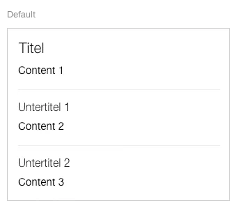
  • Sections can also be used as sub-grouping in other sections or also in accordions.
  • A question mark in the circle can also be shown – in addition to the title – for detailed explanations. A tooltip opens if this question mark is clicked on.
Variants

States

The component has the following states:

  • Default

Variants

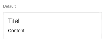
Default

Image of the fieldset component


Complex fieldset

Image of the fieldset component with complex content


Specifications

Design