What does the component do?
- Causes an action by the user for specific decisions.
When should the component be used?
- When an action has to be confirmed by the user.
- To display critical information that has to be confirmed by the user.
- To request actions that has to be confirmed by the user.
- To select decision options by the user.
Rules
Behaviour
- Dialogs are displayed as modal windows in front of the application.
- Dialogs disable all application functions and remain displayed until they have been confirmed, cancelled or a necessary action has been performed.
- Dialogs are purposefully interruptive, so they should be used sparingly.
- The dialog can be closed and thus the action cancelled in several ways:
- via the 'X' on the right in the header of the dialog.
- via a click on the 'glass' in the background
- via a 'Cancel'-button (if available)
- 'ESC' key on the keyboard
Layout
- The dialog has its own header, content area and button bar.
- It should be prevented from scrolling. If it cannot be prevented, the header and button bar are sticky.
- The primary action is placed to the left of the secondary action.
- A 'glass' is displayed behind the dialog, thus blocking editing outside the dialog.
Content
- The header may contain context-describing information (e.g. the train number).
- The content of the dialog can be used completely flexibly, e.g.
- a detailed description of the situation and a clear question to be answered by the user.
- a form to create or edit a complex data object.
Actions
- Confirmation actions are disabled until a selection is made or the form is valid (all mandatory fields filled and no incorrect entries).
- Cancel actions are never disabled.
Variants
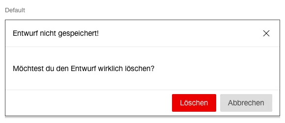
Simple (Warnings / Confirmations)
This variant has following states:
- Default

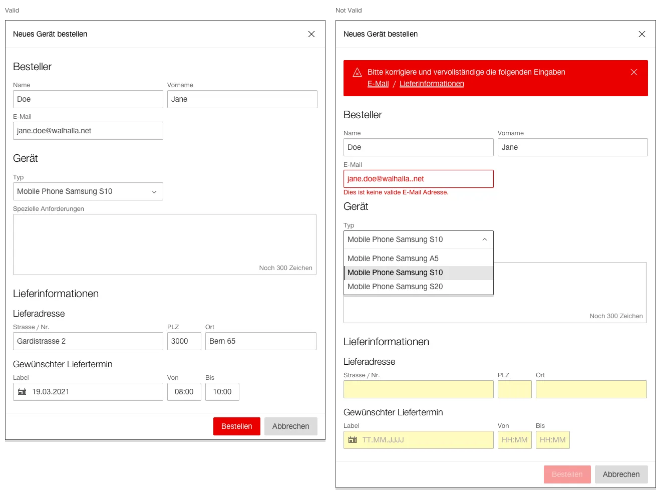
Complex (Forms)
This variant has following states:
- Valid
- Not Valid

- The complex variant is used to create or edit complex data objects if they cannot be edited directly in the content of the application.
- If the user wants to dismiss the dialog and ...
- no changes have been made, the dialog closes and no discard confirmation is required.
- the user has made changes, the user is prompted to confirm the discard action.