Zur Navigation Zum Inhalt Kontakt Menu Find component Overview Lean Principles Foundation Accessibility Design System Guidelines Deutsch Français Italiano English Our design principles User-centred Recognisable Inclusive Reduced Holistic Self-explanatory Task-oriented Appropriate SBB Brand portal Logo Digital clock Rights of use Base colors Functional colors Off brand colors Icons Timetable icons Pictograms About accessibility Über diesen Guide Contact Further information Product Owner User Research Interaction Design Visual Design Development Content Design Testing What is a design system? Designing Coding FAQ Help Process Contribution Contact Overview Base Components Overview Base Components Overview Base Components Overview Design Tokens Components Overview Base Informationen Sense & Purpose Community Assets Instructions Power-Apps Digital banner ads SAP Design Guidelines App Icons
Find component

Lean

Basics Brand

Brand

Divider

Divider

Icon

Icon

Text

Text

Typografie

Typografie

Components Accordion

Accordion

Autocompletion

Autocompletion

Breadcrumb

Breadcrumb

Button

Button

Buttonbar

Buttonbar

Checkbox

Checkbox

Chip

Chip

Contextmenu

Contextmenu

Datepicker

Datepicker

Dialog

Dialog

Fieldset

Fieldset

Fileselector

Fileselector

Filter

Filter

Header

Header

Link

Link

Loading Indicator

Loading Indicator

Menuitem

Menuitem

Notification

Notification

Pagination

Pagination

Processflow

Processflow

Radiobutton

Radiobutton

Select (Dropdown)

Select (Dropdown)

Sidebar

Sidebar

Slider

Slider

Status

Status

Tab

Tab

Table

Table

Tag

Tag

Textarea

Textarea

Textexpand

Textexpand

Textfield

Textfield

Timefield

Timefield

Toggle

Toggle

Tooltip

Tooltip

Tree

Tree

Usermenu

Usermenu

Contextmenu Overview

What does the component do?

  • It provides context-specific actions, either dynamically via right mouse click on an element or statically via an icon.

When should the component be used?

  • When actions for efficient execution are to be provided on an object depending on the status or role of the user.

Rules

  • A context menu can be provided via the right mouse click or via an icon.
  • The context menu may contain icons but does not have to.
  • On a level of the context menu, there is either an icon for all menu items or none at all.
  • Menu items can be grouped. Groups are separated by a dash.
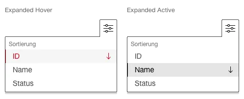
  • A context menu can be used for sorting elements. In this case, an arrow is used to show which attribute is used for sorting and in which direction.
  • Providing deeper level structures is also permitted. However, it is worth noting that the more complex, the less efficient it is to use.
States and variants

States

The component has the following states:

  • Default
  • Hover

Variants

Default

This variant also has the following states:

  • Expanded (optional)

    Image of a contextmenu

Icon

This variant also has the following states:

  • Expanded Hover

  • Expanded Active

    Image of a contextmenu with icon
  • The three dots are used for the icon as default.

Sorting

This variant also has the following states:

  • Expanded Hover

  • Expanded Active

    Image of a contextmenu with sorting function
  • The arrow icon is used to display the sorting.

  • Sorting is ascending by default.

  • When hovering over an active sorted attribute, the arrow icon is turned around.

  • The entire menu entry (name and icon) is clickable.

Specifications

DesignCode

Imprint Contact Cookie settings