Zur Navigation Zum Inhalt Kontakt Menu Find component Overview Lean Principles Foundation Accessibility Design System Guidelines Deutsch Français Italiano English Our design principles User-centred Recognisable Inclusive Reduced Holistic Self-explanatory Task-oriented Appropriate SBB Brand portal Logo Digital clock Rights of use Base colors Functional colors Off brand colors Icons Timetable icons Pictograms About accessibility Über diesen Guide Contact Further information Product Owner User Research Interaction Design Visual Design Development Content Design Testing What is a design system? Designing Coding FAQ Help Process Contribution Contact Overview Base Components Overview Releases Design Tokens Components Roadmap Overview Base Informationen Overview Base Components Sense & Purpose Community Assets Instructions App Icons Power-Apps Digital banner ads SAP Design Guidelines Button

Overview

What does the component do?

  • It triggers an action on a page.

When should the component be used?

  • When starting or ending a process.
  • When sending a form.
  • When selecting a function on a page.

Rules

  • Cannot be used within body copy.
  • Cannot be used in the header as navigation or a function.
  • The minimum width is 60px.
  • The width increases with the text length. The width is 100% for mobile views.
  • If the text is still too long when the maximum length is reached, it is shortened with “...”.
  • The text is always single-line.
  • Buttons are right-aligned in the viewport. The primary button is positioned to the left of the secondary button.
States and variants

States

The component has the following states:

  • Default
  • Hover
  • On-click
  • Disabled

Variants

Primary button

Image of a primary button

Alternative primary button

Image of an alternative primary button

Secondary button

Image of a secondary button

Ghost button

Image of a ghost button

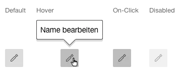
Icon button

Image of an icon button

When hovering over an icon button, a tooltip should be used to make the underlying action clearer.

Multiple actions

Image of a button with multiple actions

Specifications

DesignCode

Find component

Lean

Basics Brand Brand Divider Divider Icon Icon Text Text Typografie Typografie Components Accordion Accordion Autocompletion Autocompletion Breadcrumb Breadcrumb Button Button Buttonbar Buttonbar Checkbox Checkbox Chip Chip Contextmenu Contextmenu Datepicker Datepicker Dialog Dialog Fieldset Fieldset Fileselector Fileselector Filter Filter Header Header Link Link Loading Indicator Loading Indicator Menuitem Menuitem Notification Notification Pagination Pagination Processflow Processflow Radiobutton Radiobutton Select (Dropdown) Select (Dropdown) Sidebar Sidebar Slider Slider Status Status Tab Tab Table Table Tag Tag Textarea Textarea Textexpand Textexpand Textfield Textfield Timefield Timefield Toggle Toggle Tooltip Tooltip Tree Tree Usermenu Usermenu
Imprint Contact Cookie settings