Zur Navigation Zum Inhalt Kontakt Menu Find component Overview Lean Principles Foundation Accessibility Design System Guidelines Deutsch Français Italiano English Our design principles User-centred Recognisable Inclusive Reduced Holistic Self-explanatory Task-oriented Appropriate SBB Brand portal Logo Digital clock Rights of use Base colors Functional colors Off brand colors Icons Timetable icons Pictograms About accessibility Über diesen Guide Contact Further information Product Owner User Research Interaction Design Visual Design Development Content Design Testing What is a design system? Designing Coding FAQ Help Process Contribution Contact Overview Base Components Overview Releases Design Tokens Komponenten Overview Base Informationen Overview Base Components Sense & Purpose Community Assets Instructions Power-Apps Digital banner ads SAP Design Guidelines App Icons Autocompletion Overview

What does the component do?

  • It helps the user with entry by providing suggestions.

When should the component be used?

  • When an entry field can have lots of pre-defined values.
  • As a tool for previewing search results/fields.

Rules

  • The auto-completion always has a label.
  • Optional entries include the text ‘(optional)’ behind the label text. The text ‘(optional)’ can be shortened to ‘(opt.)’ in short fields.
  • A question mark in the circle – in addition to the label – can be used for detailed explanations. A tooltip opens if this question mark is clicked on.
  • During entry three suggestions appear (usually after three symbols but this can be modified on a project-specific base).
  • The listed entries can be scrolled through using arrow keys and accepted with ‘Enter’.
  • A maximum of ten suggestions are shown.
  • The auto-completion selection closes when an element is chosen.
States and variants

States

The component has the following states:

  • Default
  • Hover
  • Active

Variants

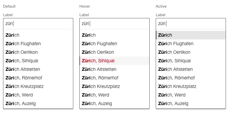
Default

Image of a autocomplete, default

With hit display

As an option to the standard variant, this variant can be used when an auto-completion list always contains more than the maximum ten hits shown.
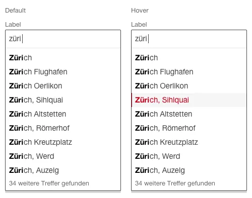
Image of a autocomplete, with hit display

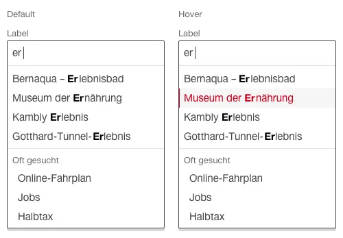
With static entries

Image of a autocomplete, with static entries

Specifications

DesignCode

Find component

Lean

Basics Brand Brand Divider Divider Icon Icon Text Text Typografie Typografie Components Accordion Accordion Autocompletion Autocompletion Breadcrumb Breadcrumb Button Button Buttonbar Buttonbar Checkbox Checkbox Chip Chip Contextmenu Contextmenu Datepicker Datepicker Dialog Dialog Fieldset Fieldset Fileselector Fileselector Filter Filter Header Header Link Link Loading Indicator Loading Indicator Menuitem Menuitem Notification Notification Pagination Pagination Processflow Processflow Radiobutton Radiobutton Select (Dropdown) Select (Dropdown) Sidebar Sidebar Slider Slider Status Status Tab Tab Table Table Tag Tag Textarea Textarea Textexpand Textexpand Textfield Textfield Timefield Timefield Toggle Toggle Tooltip Tooltip Tree Tree Usermenu Usermenu
Imprint Contact Cookie settings