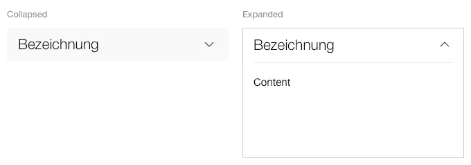
What does the component do?
- It is used for structuring content into various sub-groups.
When should the component be used?
- When clear sub-groups can be created within the content.
- When the sub-groups provide the user with additional information on the main content.
- The main content should not be packed in an accordion.
Rules
- An accordion can have 1 to n entries.
- All accordions are always closed by default.
- The accordion header always consists of a text title.
- The title may be a maximum of two lines.
- Icons in the title are not permitted.
- The entire area of the accordion header is clickable and opens/closes the accordion.
- Several or all entries can be opened at the same time. Alternatively, the ‘only one accordion expanded’ function can be used.
- An accordion component within an accordion entry is not permitted.
States
The component has the following states:
- Collapsed
- Expanded
Variants
Default
