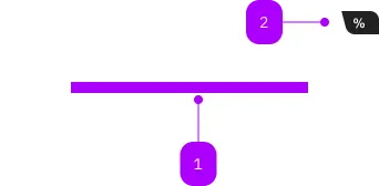
Was macht die Komponente?
Sie ist Teil der Card-Komponente.
Wann soll die Komponente eingesetzt werden?
- Nur innerhalb der Card-Komponente.

| Nummer | Typ | Beschreibung | Optional | Hinweis |
|---|---|---|---|---|
| 1 | Slot | Beliebiger Inhalt erlaubt | Nein | |
| 2 | Komponente | sbb-card-badge | Ja |
Spielwiese
The sbb-card-button is the component used to turn a sbb-card into a button.
<sbb-card-button type="submit" form="buy" value="trip">Buy this trip!</sbb-card-button>
Button properties
The component is internally rendered as a button,
accepting its associated properties (type, name, value and form).
Accessibility
It's important that a descriptive message is being slotted into the unnamed slot of sbb-card-button
as it is used for search engines and screen-reader users.
<sbb-card-button>Buy a half-fare ticket now</sbb-card-button>
Properties
| Name | Attribute | Privacy | Type | Default | Description |
|---|---|---|---|---|---|
active | active | public | boolean | false | Whether the card is active. |
form | form | public | HTMLFormElement | null | The <form> element to associate the button with. | |
name | name | public | string | Name of the form element. Will be read from name attribute. | |
type | type | public | SbbButtonType | 'button' | The type attribute to use for the button. |
validationMessage | - | public | string | Returns the current error message, if available, which corresponds to the current validation state. Please note that only one message is returned at a time (e.g. if multiple validity states are invalid, only the chronologically first one is returned until it is fixed, at which point the next message might be returned, if it is still applicable). Also, a custom validity message (see below) has precedence over native validation messages. | |
validity | - | public | ValidityState | Returns the ValidityState object for this element. | |
value | value | public | string | '' | Value of the form element. |
willValidate | - | public | boolean | Returns true if this element will be validated when the form is submitted; false otherwise. |
Methods
| Name | Privacy | Description | Parameters | Return | Inherited From |
|---|---|---|---|---|---|
checkValidity | public | Returns true if this element has no validity problems; false otherwise. Fires an invalid event at the element in the latter case. | boolean | SbbFormAssociatedMixin | |
reportValidity | public | Returns true if this element has no validity problems; otherwise, returns false, fires an invalid event at the element, and (if the event isn't canceled) reports the problem to the user. | boolean | SbbFormAssociatedMixin | |
setCustomValidity | public | Sets the custom validity message for this element. Use the empty string to indicate that the element does not have a custom validity error. | message: string | void | SbbFormAssociatedMixin |
Slots
| Name | Description |
|---|---|
| Use the unnamed slot to add a descriptive label / title of the button (important!). This is relevant for SEO and screen readers. |